Well, this has been a long time coming.
Variable fonts (a.k.a., OT-VAR, or OpenType Variable) started to become a thing in late 2016, with backing by Apple, Microsoft, Adobe, and Google. The standard took a while to be worked out, but it’s fairly settled now.
The good news is that variable fonts work great in all the major web browsers, and the web is where variable fonts make the biggest difference. It lets you put an entire font family with unlimited styles into a single font file that is about the same size as a few traditional fonts. This gives the web designer a much larger typographic palette without the bandwidth penalty.
On the desktop, variable fonts are not as well-supported. Adobe Creative Cloud apps (Photoshop, Illustrator, and InDesign) have good support at this point. Others include Sketch and Corel Draw. You can see a current list here. I expect this will improve over time and, eventually, they will work everywhere.
I knew from the beginning that I would want to do a variable version of Proxima Nova. I started work on it in late 2017. This was when support was low and the standard was in flux, so it sat on the back burner after some initial tests.
In Spring of 2019, I enlisted the help of Rainer Erich Scheichelbauer and his team at Schriftlabor for technical and production assistance. Although I’m an old hand at making OpenType and other kinds of fonts, I felt a bit out of my depth with variable fonts. Given the amount of user stress that a variable version of a face as popular as Proxima Nova would need to withstand, I needed to bring in an expert. Rainer has been at the cutting edge of variable font technology, including being one of the developers of Glyphs (the app I use to make fonts), so it was in good hands.
Nearly two years later, I’m ready to introduce Proxima Vara. (You can try it out here.)
Proxima Vara is a completely new family, not an update to Proxima Nova, and there are some differences. One is that the default figure style is tabular rather than proportional. This was often requested by Proxima Nova users, but changing it would have affected existing users’ documents. There are also improvements to character shapes and spacing.
Proxima Vara, as a variable font, contains built-in weight and style “instances” that match Proxima Nova and can be selected in font menus, as if they were separate fonts. There are six new styles, in the new Extralight weight, making 54 styles, up from 48.
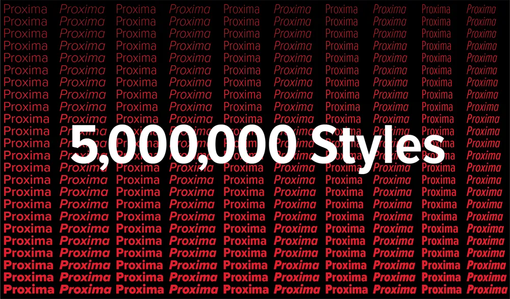
Unlike Proxima Nova, you are not limited to these built-in styles and can specify any arbitrary style along the weight, width, and slant axes using sliders or by specifying values, for example in CSS. In all, there are 5,000,000 possible styles, going from Thin Extra Condensed to Black Italic.
L**icenses for Proxima Vara start at US$99** for a basic desktop license and will be rolling out at most of my distributors starting today. (See “Buy” on this page.)
The one exception is Adobe Fonts (a.k.a., Typekit), which is unfortunately not yet ready to host variable fonts for web or desktop use.
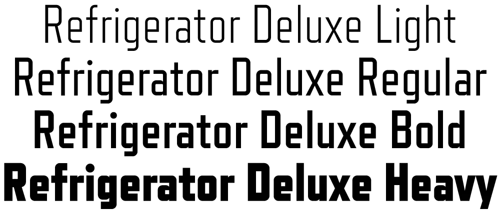
Refrigerator dates back to 1988 as one of my earliest PostScript typefaces. The concept was very simple: A blocky, condensed sans serif with rigidly geometric forms. I was inspired partly by Neville Brody’s Industria, but very quickly it veered toward more of a mid-20th century vernacular appearance. It wasn’t based on anything specific. Rather, it seemed to come from memories of block-style lettering from when I was young.
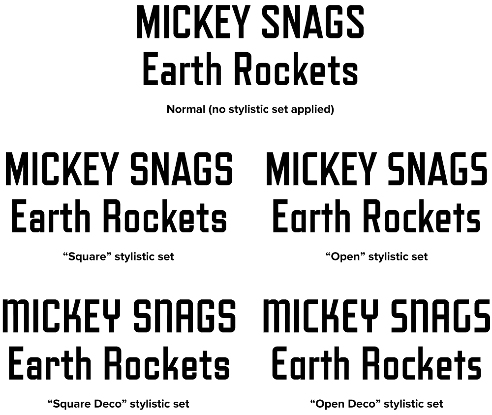
Refrigerator Deluxe (2008) extends the family from a specific vernacular style to an anthology of vernacular styles through the extensive use of alternate characters, nearly doubling the character count. (The alternate characters are accessed either through OpenType Stylistic Sets or the Glyph palette, depending on your software application). These range from squared off, closed shapes, with a minimum of angled strokes, to open, stylized shapes with more of an Art Deco feel. Using different combinations of these alternates, Refrigerator Deluxe can take on an endless variety of appearances from basic block to high style.
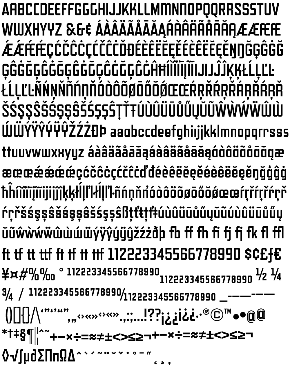
Also new in Refrigerator Deluxe is the addition of a fourth weight (Regular), improvements in many small details, like spacing, kerning, hinting (for better on-screen display), character design refinements, extensive language support (most Western and Central European Latin-based languages), fractions, case-sensitive forms, and lots of “f” and “t” ligatures.
For more information, I’ve made two PDFs you can download:
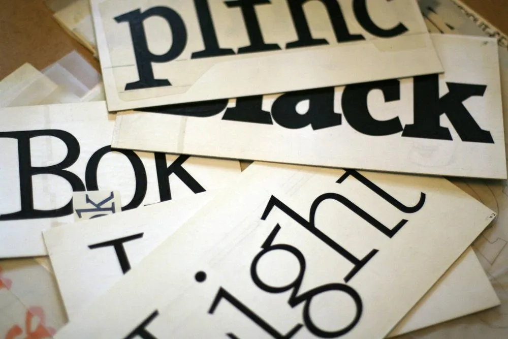
Viroqua’s ancestor, Excalibur, hand inked.
I released Kandal in 1994. It’s one of my earliest typeface designs, going all the way back to an earlier design in 1978, which I submitted it to International Typeface Corporation (ITC) under the name “Excalibur”. It went through a couple of iterations before the one I submitted, variously influenced by the work of Hermann Zapf and Jim Parkinson. I honestly had very little idea what I was doing—a case of overestimating what I knew and underestimating how much was left to know. By a large margin. Excalibur was understandably rejected by ITC. It had lots of problems and I resolved to improve my knowledge and skills before trying to submit something to them again.

Fast-forward to 1990. I never did submit any more typefaces to ITC, but I did have lots of ideas and sketches and practice drawing letters. I also got a Mac in 1984 and Fontographer in 1987 and started trying to make PostScript fonts. One of my ideas was to revisit Excalibur, simplifying the design and addressing its many flaws. This became Kandal. I was also working on Proxima Sans, the predecessor to Proxima Nova, around the same time, and a few other ideas, some of which are still on the drawing board.
Kandal has never been one of my popular typefaces. It’s not surprising, given that it was such an early design, made when I had very little experience making fonts. I probably should have pulled it from my library, but I kept thinking I would come back to it and fix it, like I did with Proxima Sans.
Thirty years later, it’s finally happened. The new version is reworked from the ground up, so I decided to give it a completely different name, instead of something like Kandal Nova. “Kandal” was my paternal grandmother’s maiden name and the town in Norway her family was from. The new name, “Viroqua”, is the town in Southwestern Wisconsin where she was born and raised.

Viroqua is an improvement over Kandal in every way I could think of, while retaining its core design concept: A hybrid combining modern proportions, Jenson-like details, and a bit of slab serif DNA. Nearly every character has been reworked or refined. The original italic especially suffered from my lack of experience as a type designer. I basically started over. I’ve got three more decades of experience and I hope it shows.

Viroqua also has a wider range of weights, seven in all, going from Thin to Black.

Viroqua features many typographical niceties missing from Kandal, such as small caps, old style and lining figures (both proportional and tabular), superscript and subscript figures, fractions, and dingbats. Viroqua also supports most Latin-based Western and Eastern European languages, plus Vietnamese.
Viroqua is available now. More information here.
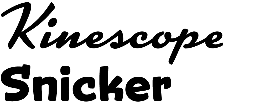
I’m proud to announce the release of two new display fonts: Kinescope and Snicker. Both fonts were inspired by hand-lettered titles in the old Fleischer Brothers’ animated Superman cartoons from the 1940s.
Kinescope uses advanced OpenType magic to choose the most pleasing character shapes as you type and features extended language support. (An application with advanced OpenType support required for the magic stuff.) To find out more, check out the Kinescope User Guide (1.6mb PDF).
Advanced OpenType support is not required by Snicker, but it has some tricks up its sleeve, including case-sensitive punctuation, automatic fractions, and extended language support. To find out more, check out the Snicker User Guide (1.2mb PDF).
For the first month, Kinescope and Snicker will be available as low as $29 each exclusively from Font Bros. Follow these links for more details:
June 1 Update: Kinescope and Snicker are now available here at Mark Simonson Studio as well.
I’m really honored to have my Lakeside and Filmotype Zanzibar among the 40 typefaces chosen in Typographica’s “Our Favorite Typefaces of 2008”. Thanks so much, Dyana and J.F.
I participate in this annual tradition from the other side of the fence as well. I chose Nick Shinn’s Modern Suite, which blew me away when I saw the specimen book for it at last year’s TypeCon in Buffalo.
