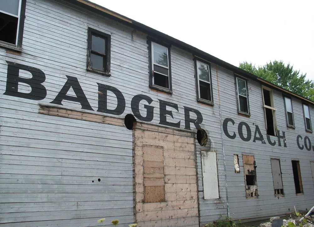
Vintage hand-painted sign seen in Evansville, Wisconsin on August 7, 2004. This building was in the process of being restored. It had been covered in imitation brick tar paper. Amazingly, the surface beneath is barely weathered. The building was painted silver with these large coal-black letters about two feet tall on both sides of the building. The style appears to be late nineteenth century, but it could have been later than that, especially considering the condition.
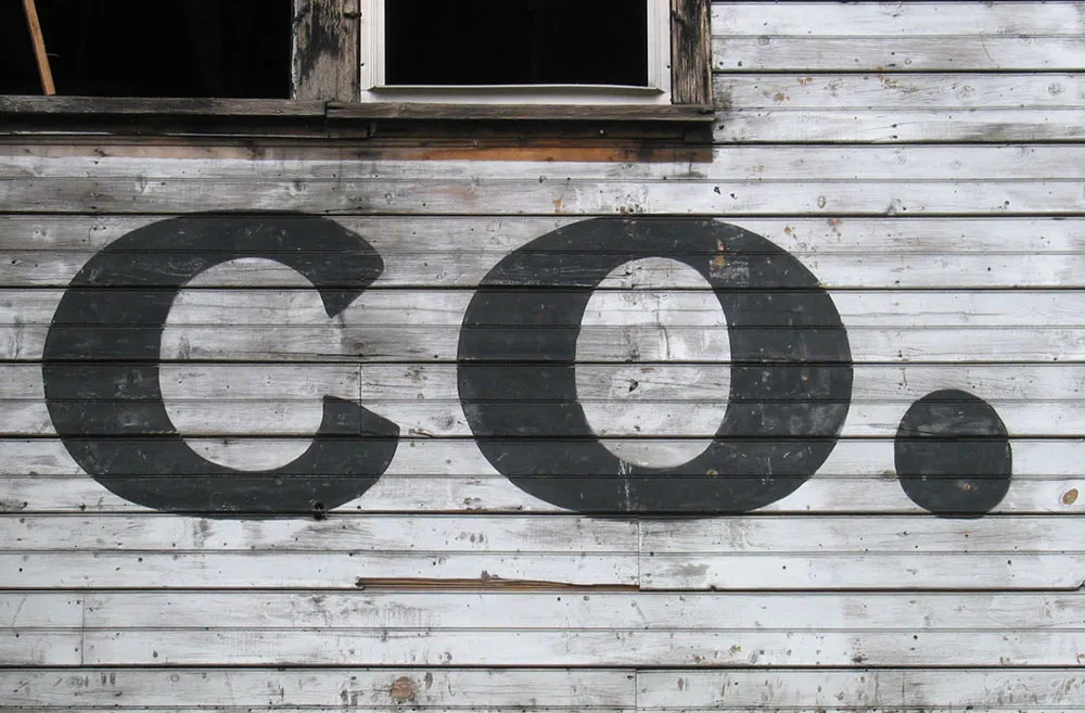
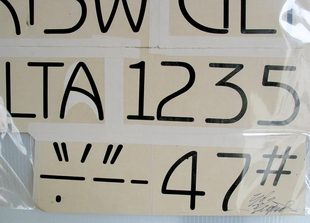
Original (signed) drawings by type and lettering legend Ed Benguiat for his typeface Benguiat Gothic. Seen in the Type Gallery at TypeCon2004 in San Francisco on July, 24, 2004.
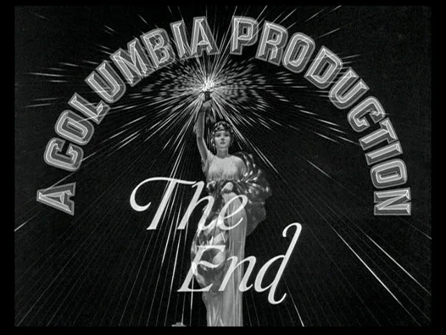
A while back, I posted a link to one of my favorite site’s, Steven Hill’s Movie Title Screens Page, “shillpages” for short. As wonderful as it is, there’s an even better one: Christian Annyas’ The Movie Title Stills Collection. It has a lot of the same material, but it’s much better organized, and also includes end titles and trailer titles.
One thing to keep in mind: Nearly all the titles that were done before the 1960s were hand lettered. Type was just too inflexible and limiting back then, so it was standard procedure to hire a lettering artist. In other words, don’t ask me what “font” was used for The Big Sleep or The Thin Man. Incidentally, if you want lettering, I can help with that.
(A big thanks to Johno of I Love Typography and We Love Typography for telling me about the Annyas site.)
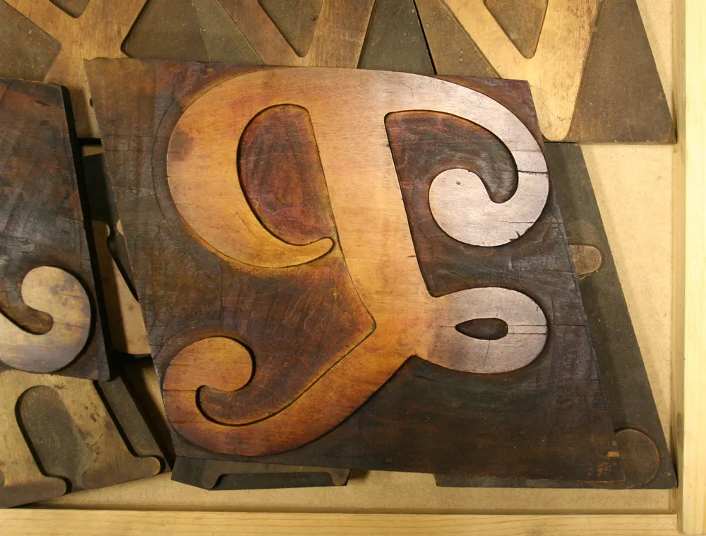
Large (about 6 inches tall) wood type “P”, seen at the Hamilton Wood Type & Printing Museum, Two Rivers, Wisconsin, on March 31, 2009.
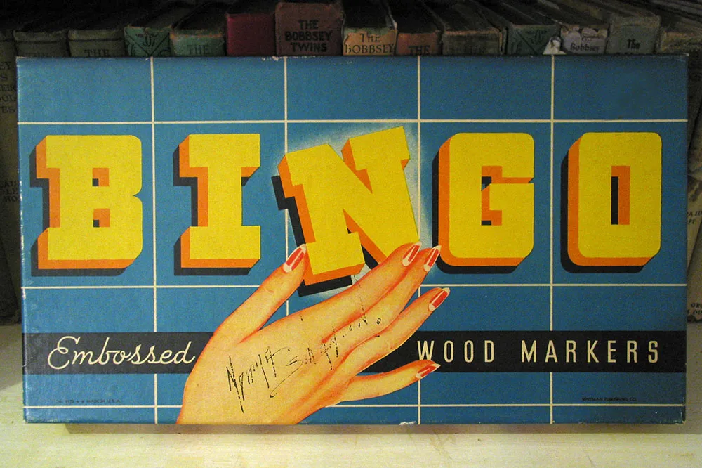
Vintage game box. Seen in an antique store in Prescott, Minnesota, July 10, 2004.
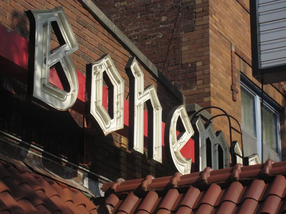
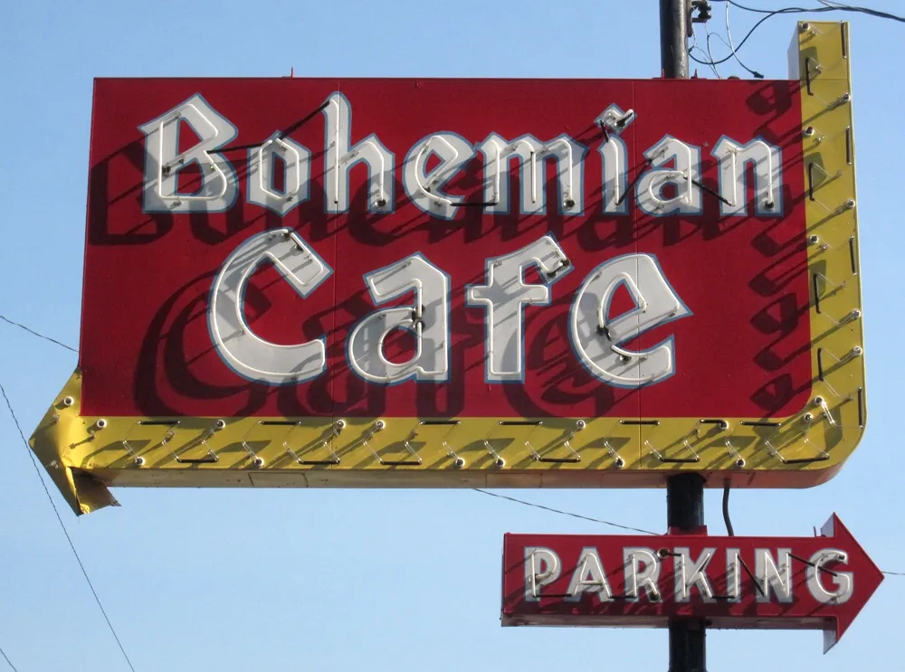
The Bohemian Cafe in Omaha, Nebraska. Shot on August 23, 2011.
