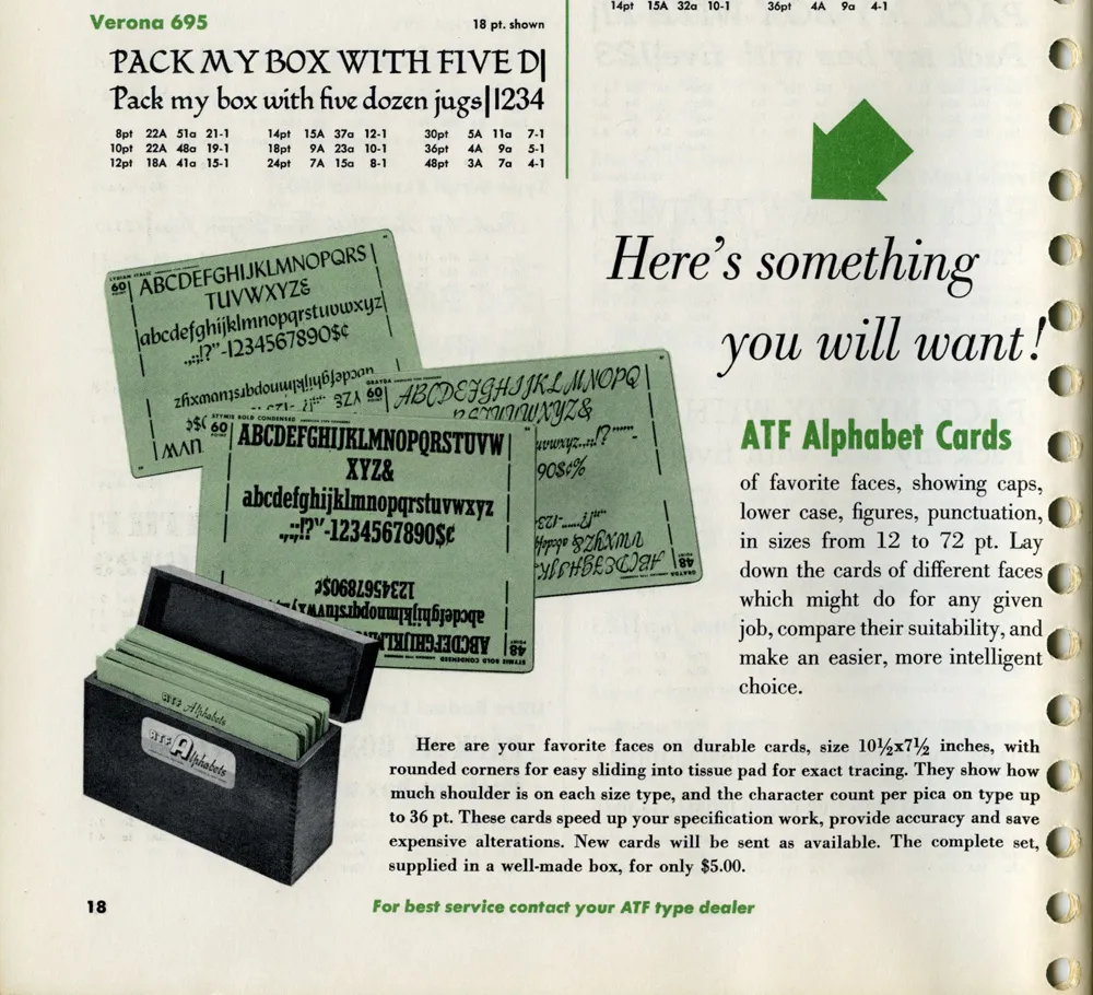
While looking for some obscure typographical thing this morning, this ad in a 1955 ATF (American Type Founders) catalog caught my eye:
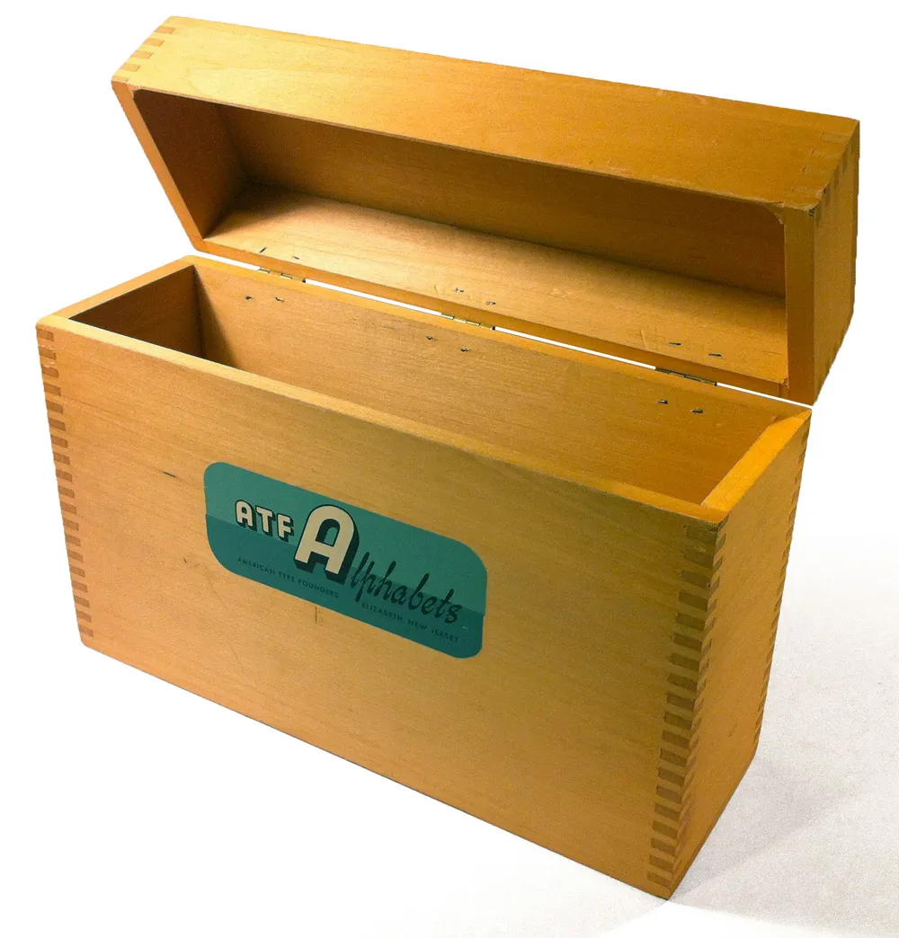
I have several boxes like the ones shown in the photo. I acquired them with a bunch of other stuff some years ago when the University of Minnesota Journalism School revamped its graphics lab. Here’s one of them:
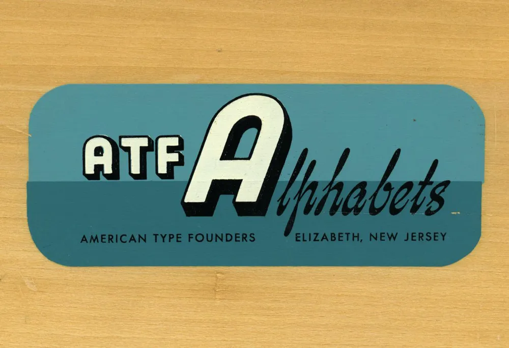
The silk-screened label is beautiful:
It’s too bad I don’t have any of the type sample cards they were designed to hold. “Here’s something you will want!” Still true, even in 2012.
Postscript: An Etsy page with photos of what went in these boxes. Thanks to Joel for the link, and thanks to Kathy for sending me a complete set of the cards.
While I was visiting Omaha this past summer (I spoke and did a workshop for AIGA Nebraska), I spotted this curious bit of typographic design:
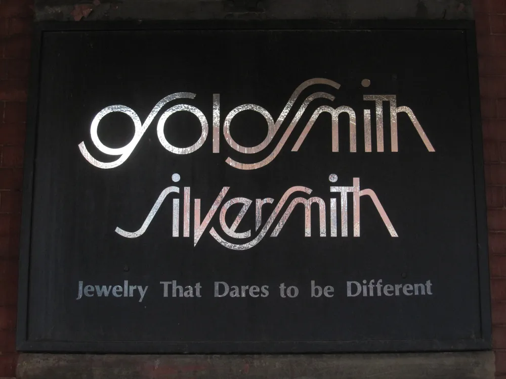
Looks like the artist was going for a Lubalin-style solution—Avant Garde with Swashes. It’s attractive, but not very easy to read, especially the “g”.
I wonder how long it’s been in use? I can’t decide if this is a design from the seventies or eighties, or if it’s a recent design imitating that period. I’m leaning toward the former, mainly because of the use of Optima in the tag line.
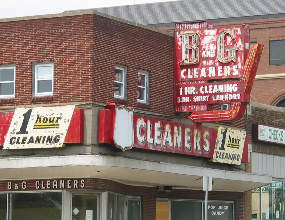
Vintage sign seen in St. Paul on June 8, 2002. The building was demolished a few days later.
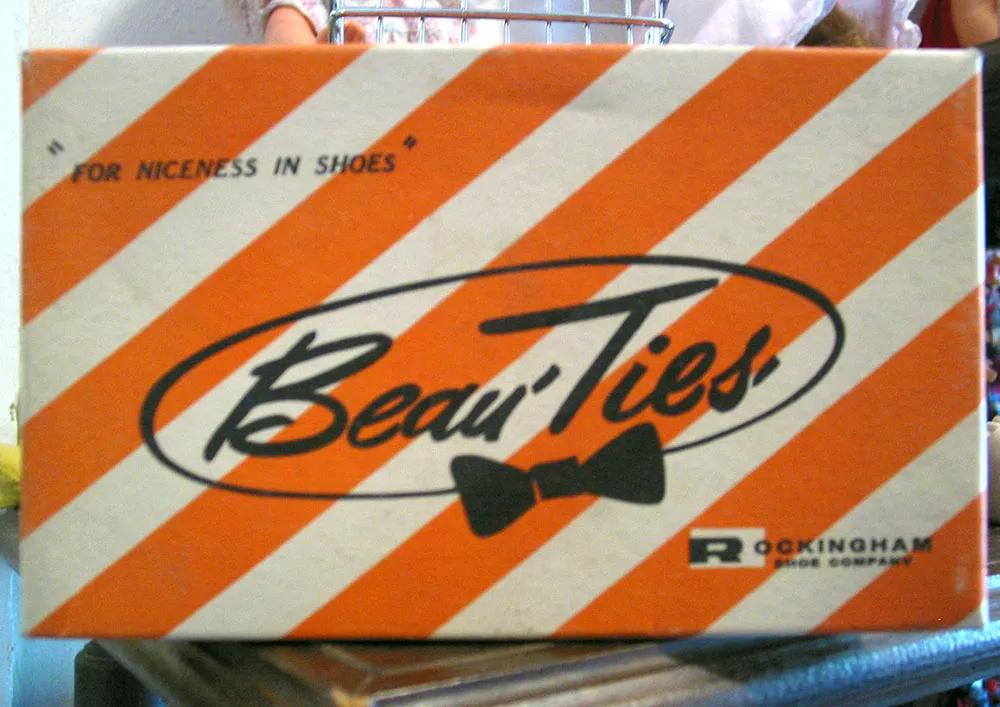
Like it says on the box: “For Niceness In Shoes.” Seen in an antique store on July 7, 2004 in Prescott, Minnesota.
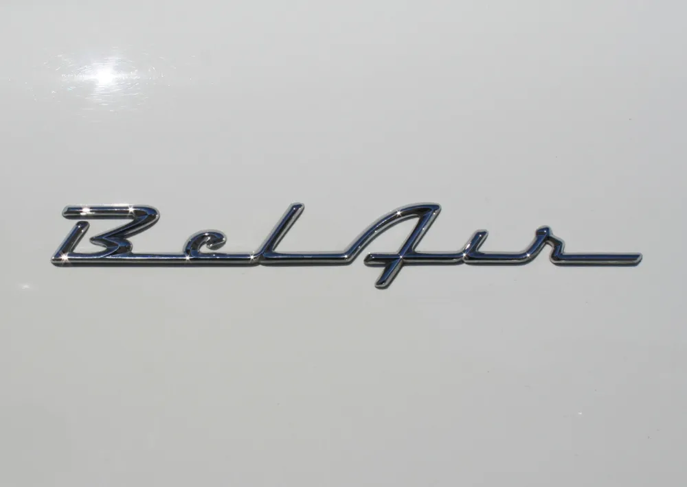
We live a few blocks from the Minnesota State Fairgrounds, and every summer the “Back to the Fifties” car show is held there. There’s usually no need to actually pay to get into it to see the cars—our neighborhood is full of them, cruising around, for the duration of the show. But lately I’ve paid to get in, mainly to get shots of the nameplates, or “brightwork” as it is known.
The Chevy “Bel Air” nameplate, from the late-fifties, is my all-time favorite. The design is so simple and stylish. (Photo taken in Saint Paul, Minnesota, June 20, 2009.)
There might be a personal bias to my “Bel Air” preference. We always had Chevys when I was a kid, a ’59 Bel Air and a ’64 Bel Air—the car I learned to drive on and the car I drove during high school in the early seventies. Here’s a cartoon painting I did of it back then as a joke:
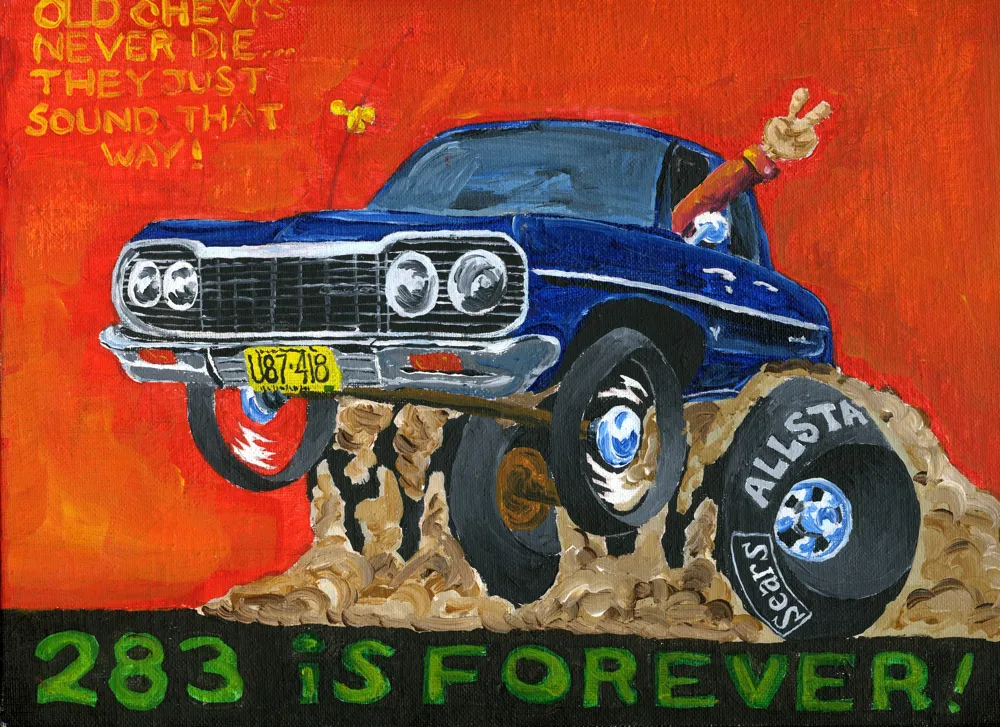
(When I was in high school, I had a little side business doing cartoon drawings of cars like this for my friends. I’ll post more of them sometime.)
