A week ago, my family and I paid a visit to the Hamilton Wood Type & Printing Museum in Two Rivers, Wisconsin. We spent about an hour or so there with Norb Brylski as our guide. Norb was one of the last people to be employed making wood type at Hamilton. He’s retired now, but volunteers at the museum and still makes new wood type for commissions brought to the museum, such as the recent wood typeface designed by Matthew Carter.
Hamilton was one of the largest wood type foundries in the U.S. and had a virtual monopoly by about 1900. It stopped making wood type in the 1980s. The museum opened in 1999 and houses the largest collection of wood type in the world, with 1.5 million pieces. They also have all the equipment to make the stuff (it all still works) and a small print shop which visiting artists (for example) can use.
Anyway, it was pretty cool, especially if you like type.
December 8, 2020 Update: Back in 2005 when I first posted this entry, I posted a little Flash-based slide show. Flash is obsolete now, so I unpacked all the photos and captions it contained and have presented them below.
A lot has happened with the museum since 2005. The original building no longer exists, having been demolished in 2015. The museum moved a few blocks away to another former factory building, in many ways a better home for it. Also, sadly, Norb Brylski, long-time and beloved museum volunteer seen in several of the photos below, passed away in 2018.
I’d also like to point out that when I posted this in 2005, it had been my first visit to the museum. I’ve been back quite a few times since then. Every November since 2009, they’ve held what they call The Hamilton Wayzgoose, and I’ve attended all of them (virtually this year, due to COVID). I’ve also helped support the museum financially since 2012 and am a member of its artistic board.
I highly recommend visiting The Hamilton Wood Type & Printing Museum if you ever get a chance. Other than the building and Norb, everything you see in these photos and more is still there.
Without further ado, step back in time with me to 2005…

The main sign for Hamilton Manufacturing in Two Rivers, Wisconsin. The company is still one of the largest employers in the area, although it ceased making wood type in the 1980s. Nowadays, it makes cabinets for dentists and other professions.
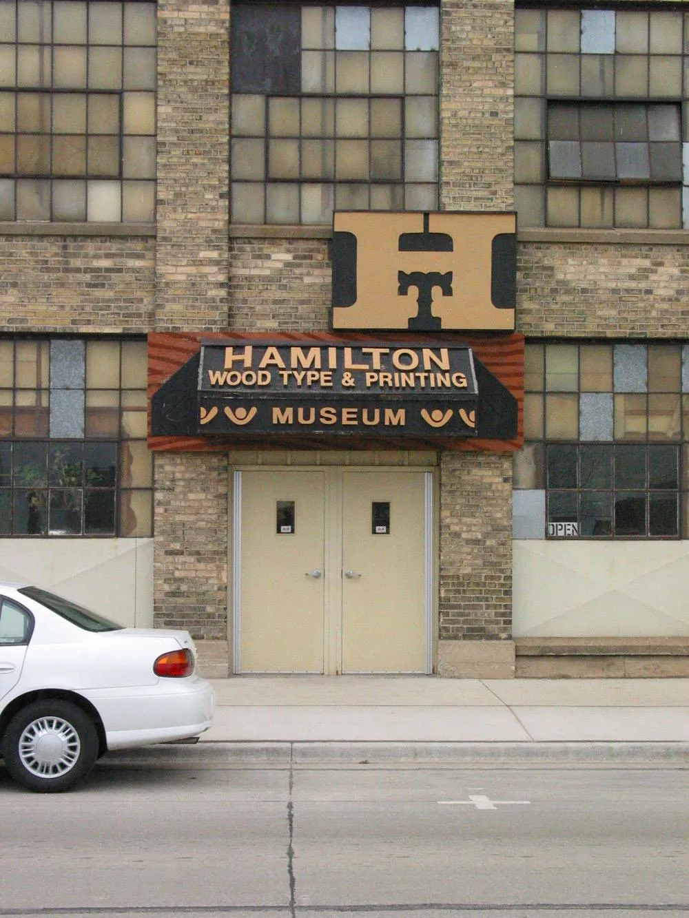
About a half a block down from the big blue sign is the entrance to the Hamilton Wood Type Museum. The sign is made to look like the handle on a drawer of type. The drawer motif continued to the right and left with faux wood like the front of a large wooden drawer, but I guess they decided it was better not to cover the windows.
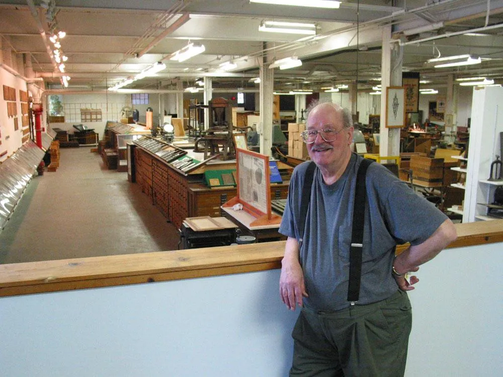
Our tour guide was Norb Brylski, a retired Hamilton employee who volunteers at the musem. Norb was one of the last people to be employed making wood type. He and a few others are still doing some commissioned work at the museum.
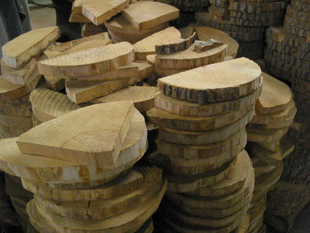
Half round slabs of rock maple like these are the raw material for what will become wood type. This is the way the wood arrived from the lumber company.
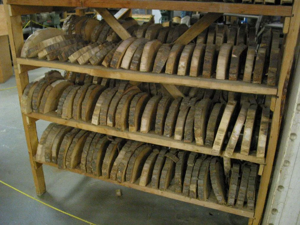
The wood needed to dry for several months before it could be used.
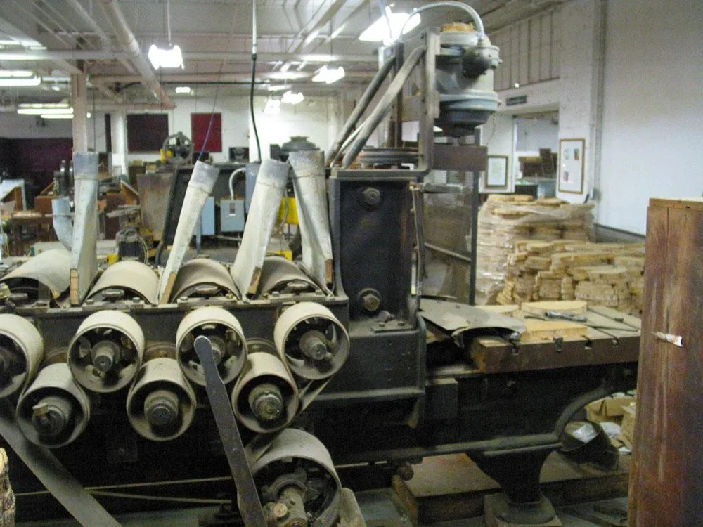
The slabs were planed smooth and to a precise thickness on this machine. After this, they were shellacked and polished to give the wood a smooth hard surface.
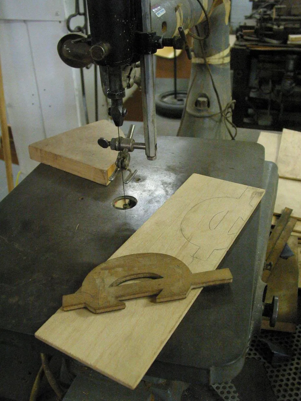
For each character, large patterns, many times larger than the final type, were cut out of thin wood on a jigsaw like this.
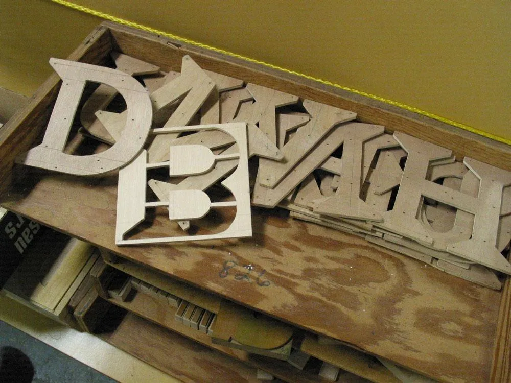
Some unfinished patterns after they have been cut out. These patterns happen to be for a wood typeface called Carter Latin designed recently by Matthew Carter for the museum.
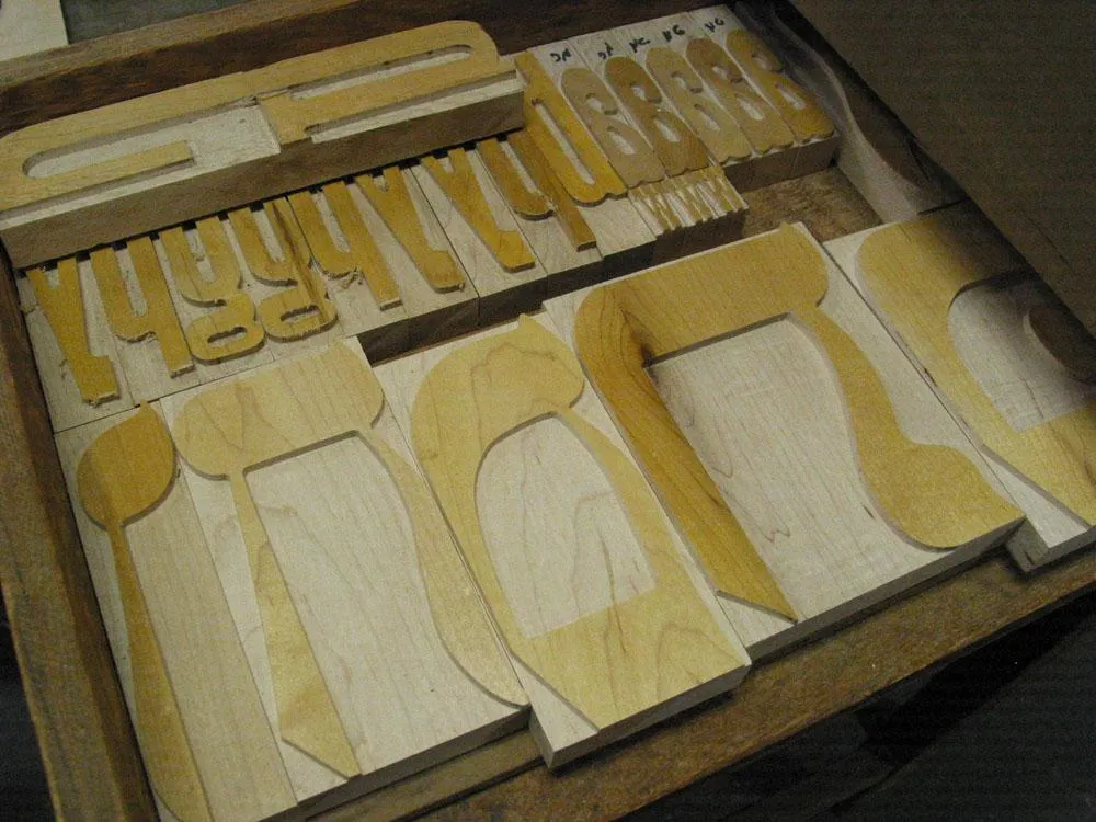
To complete the process, the patterns are mounted on a block of wood using small nails. These are Hebrew characters from another recent commission.
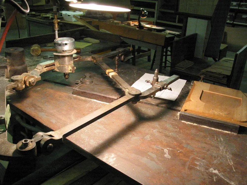
The actual wood type is cut on a pantographic cutter. The cutting blade spins like a router saw. It’s pneumatic and very loud.
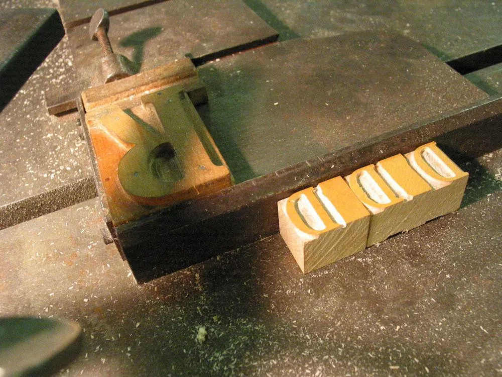
Here is a patter for a capital R mounted on the pantographic cutter.
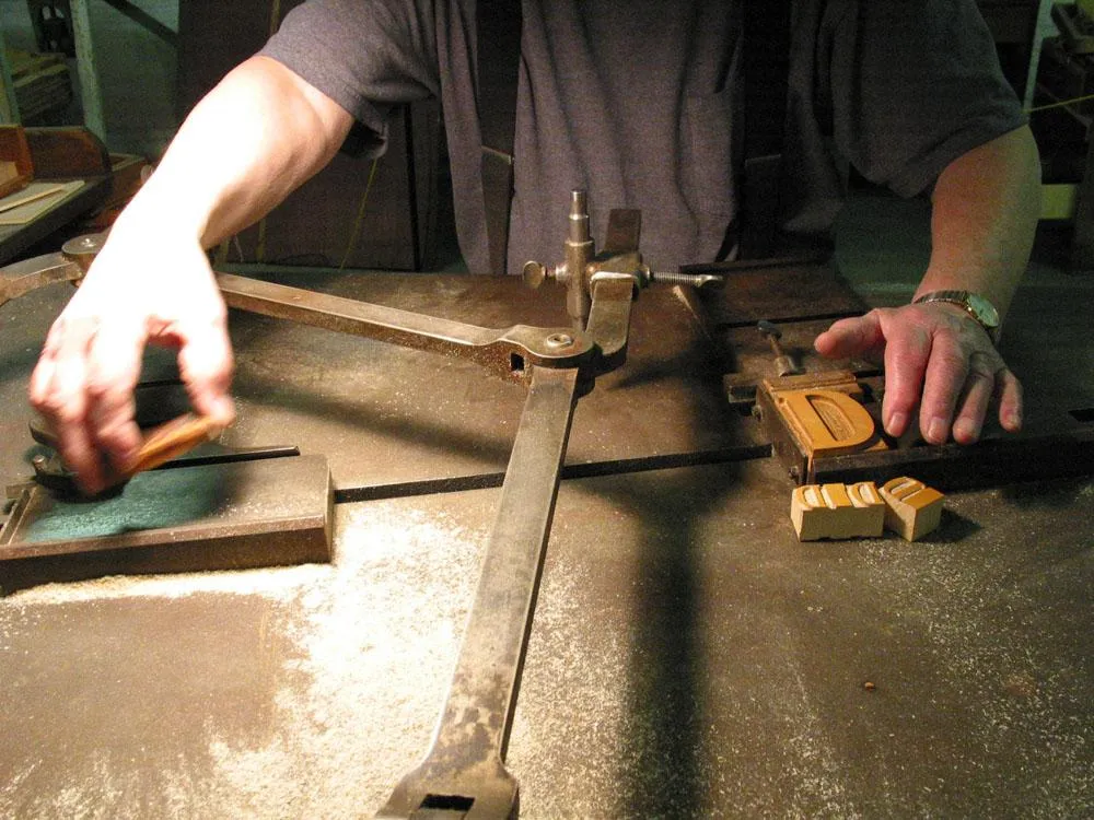
Here Norb is mounting a wood blank to be cut into a piece of type. (Unfortunately, my camera memory card ran out right after this and I missed getting a shot of the actual cutting. Sorry.)
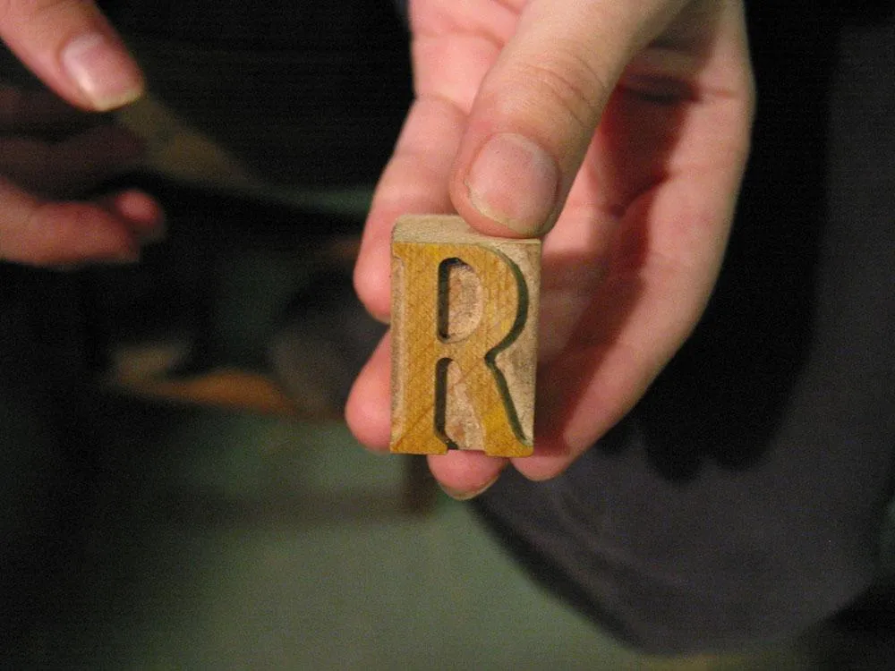
A finished piece of wood type, about an inch tall. Eagle-eyed type nerds may wonder why it’s not backwards. This is a special right-reading font for making souvenir nameplates and such. Also, this piece is not quite finished. Normally, they would go in with a finer cutting blade to make the inside corners sharper.
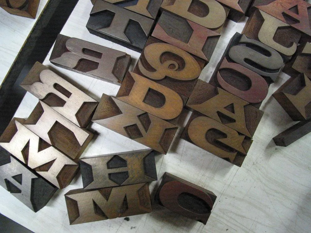
Latin Extended.
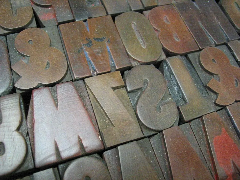
Gothic Condensed.
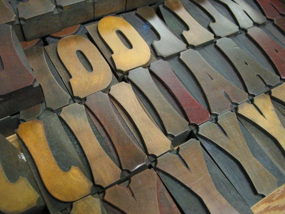
A beveled style.
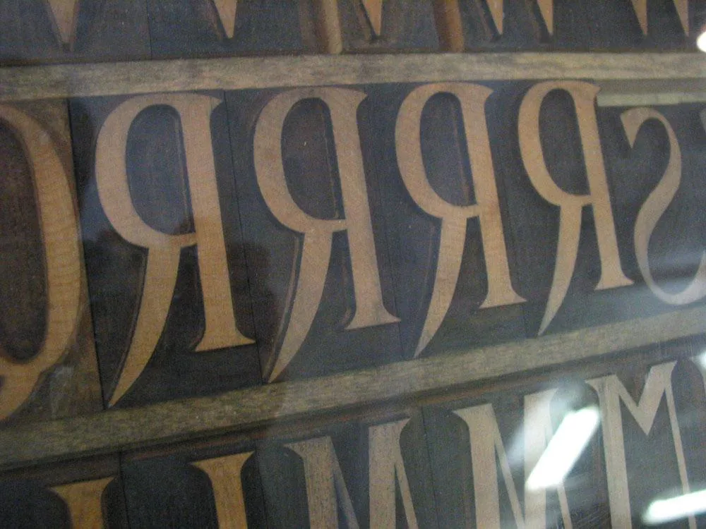
DeVinne.
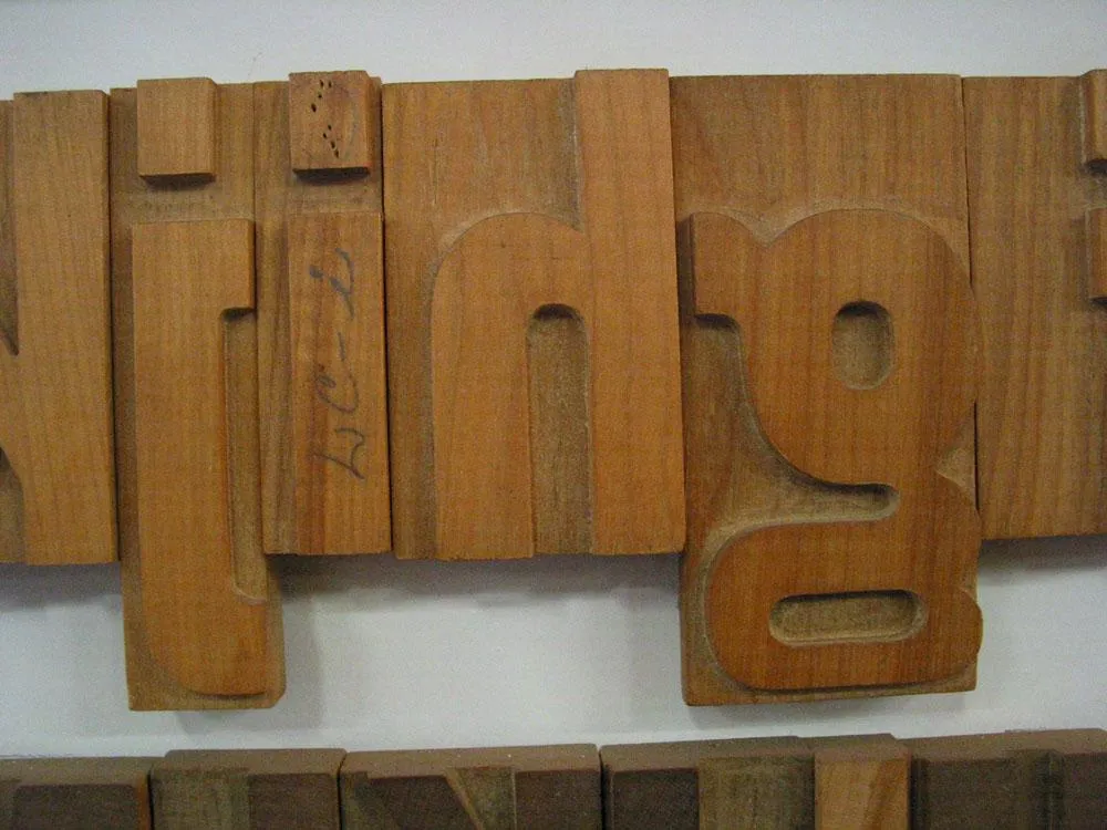
Some very large (almost a foot tall) Gothic Condensed.
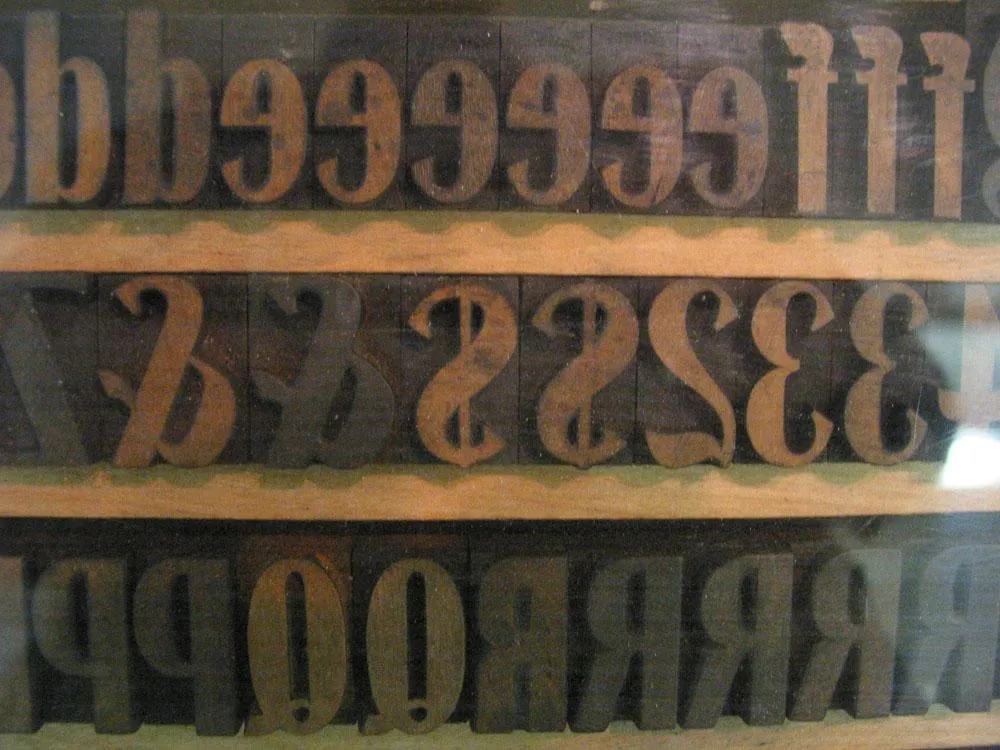
Modified Gothic Condensed.
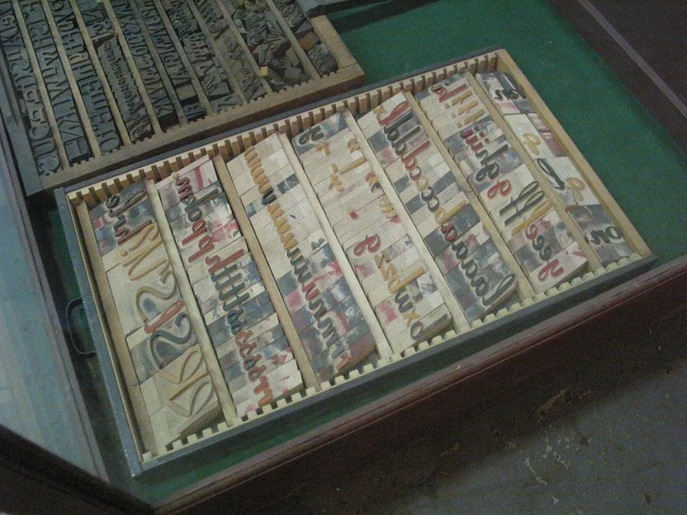
Coronet (probably a much later addition to the library).
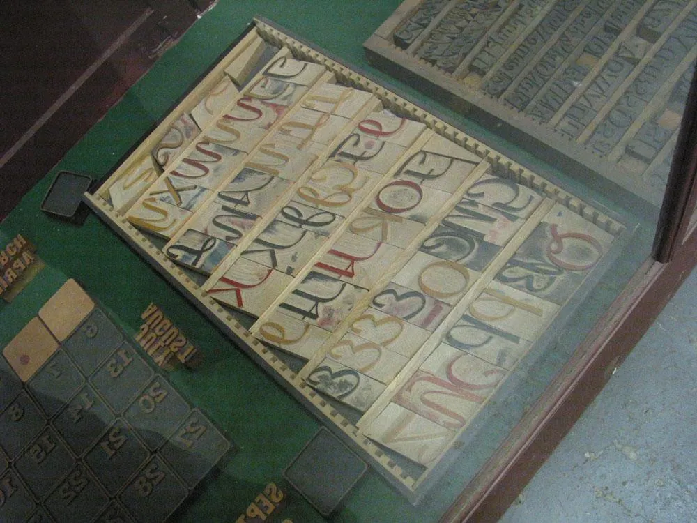
More Coronet.
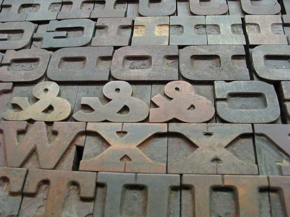
Aldine Extended.
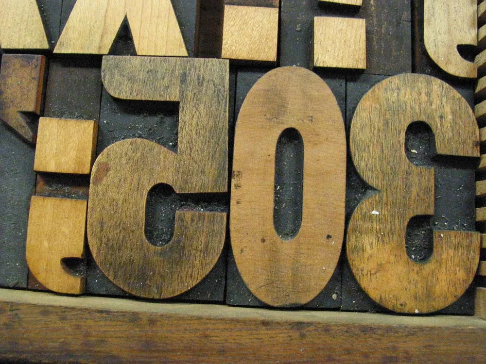
More Gothic Condensed.
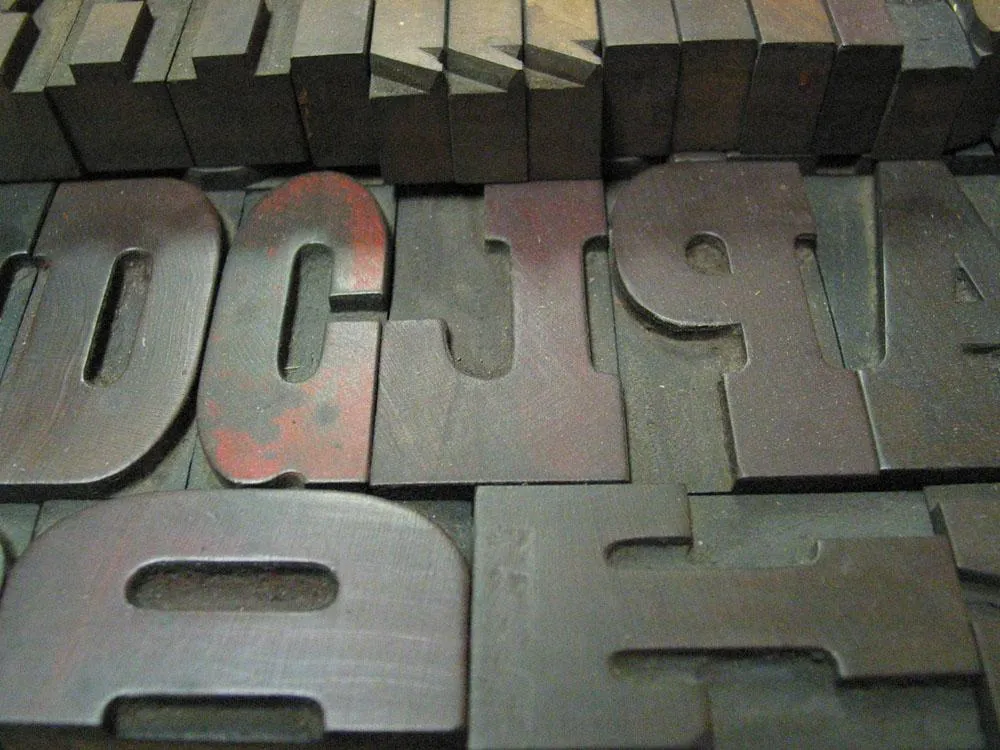
A Clarendon.
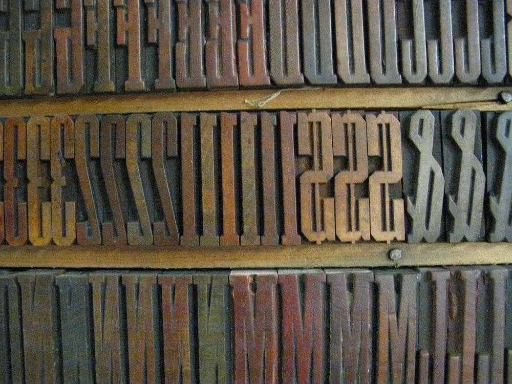
Grecian XX Condensed
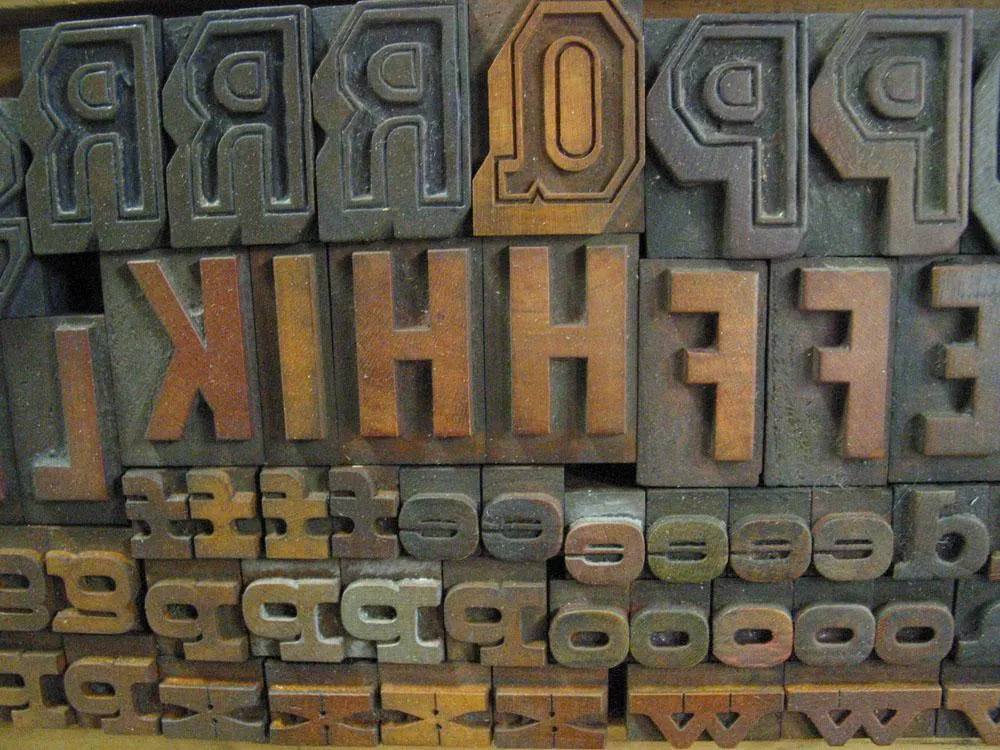
Various styles.
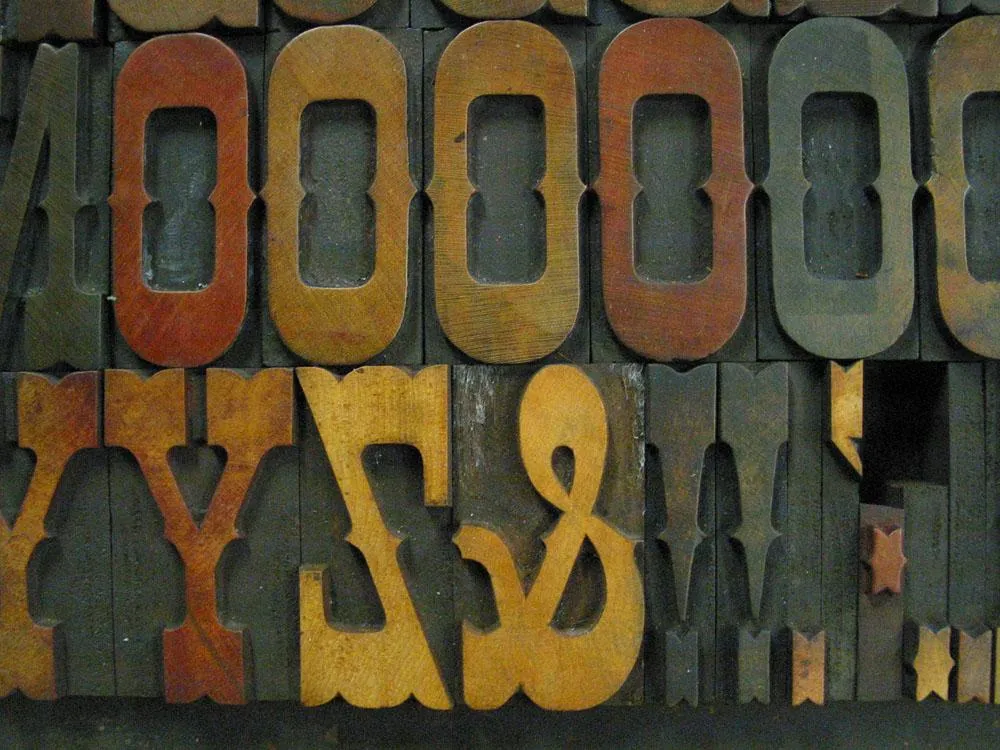
Egyptian Ornamented.
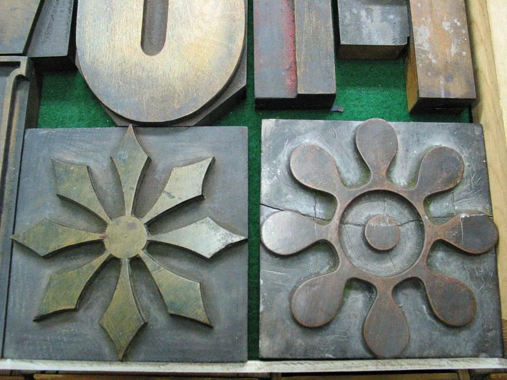
Some very large ornaments, about six inches tall.
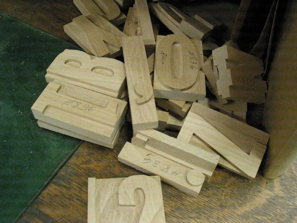
These cut but unfinished pieces of wood type were off in a corner.

As I mentioned, the type cutter is very loud. Ear protection is recommended. Some more of Matthew Carter’s font patterns visible here.
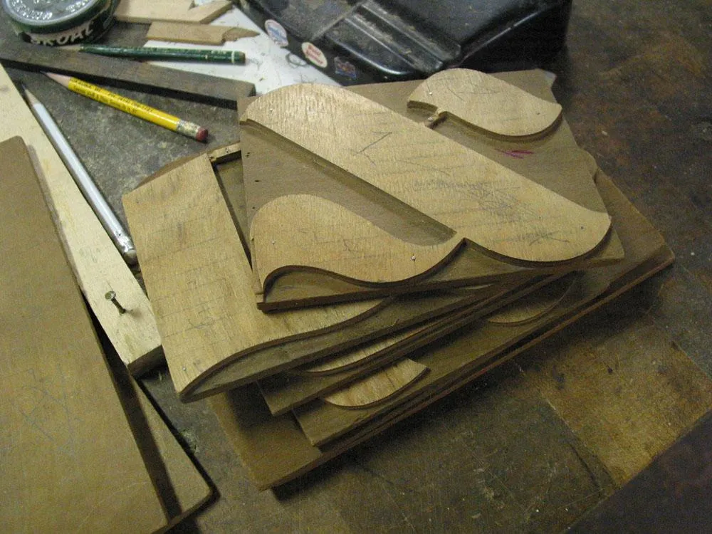
Some big beautiful patterns for a Hebrew font.
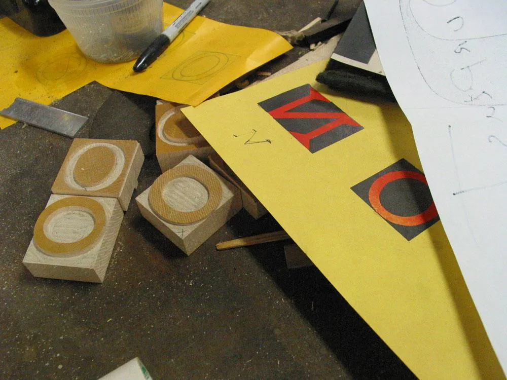
A few pieces of Carter Latin and some proofs.
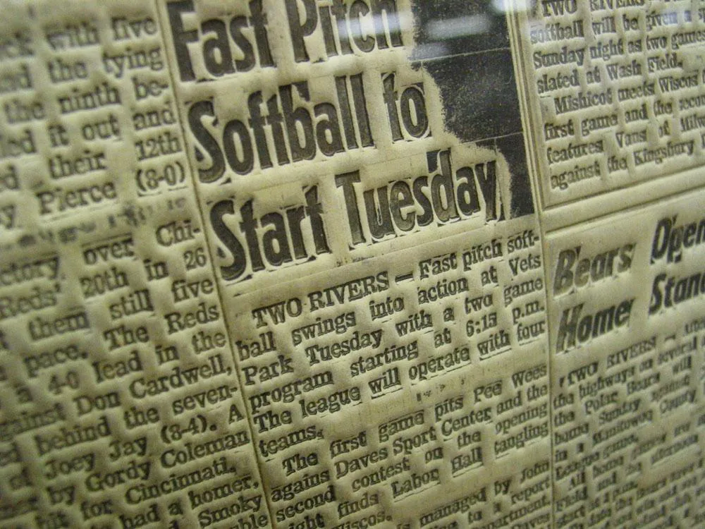
A close up of a flong, a kind of flexible paper mold used in the stereotype process by newspapers to copy a full page of type in order to make curved plates for letterpress printing. (Now you know where the word “stereotype” comes from.)
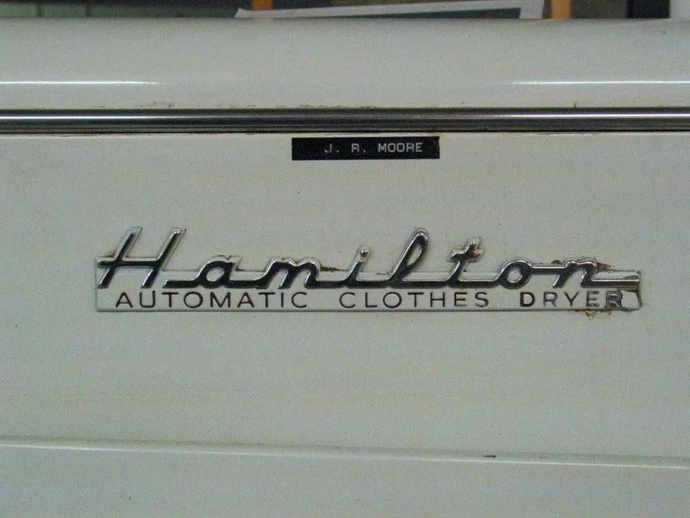
Hamilton also made the first automatic clothes dryer in the 1950s.
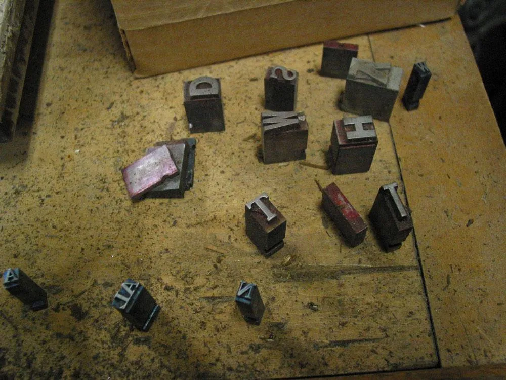
Lying here and there in the museum were pieces of metal type.
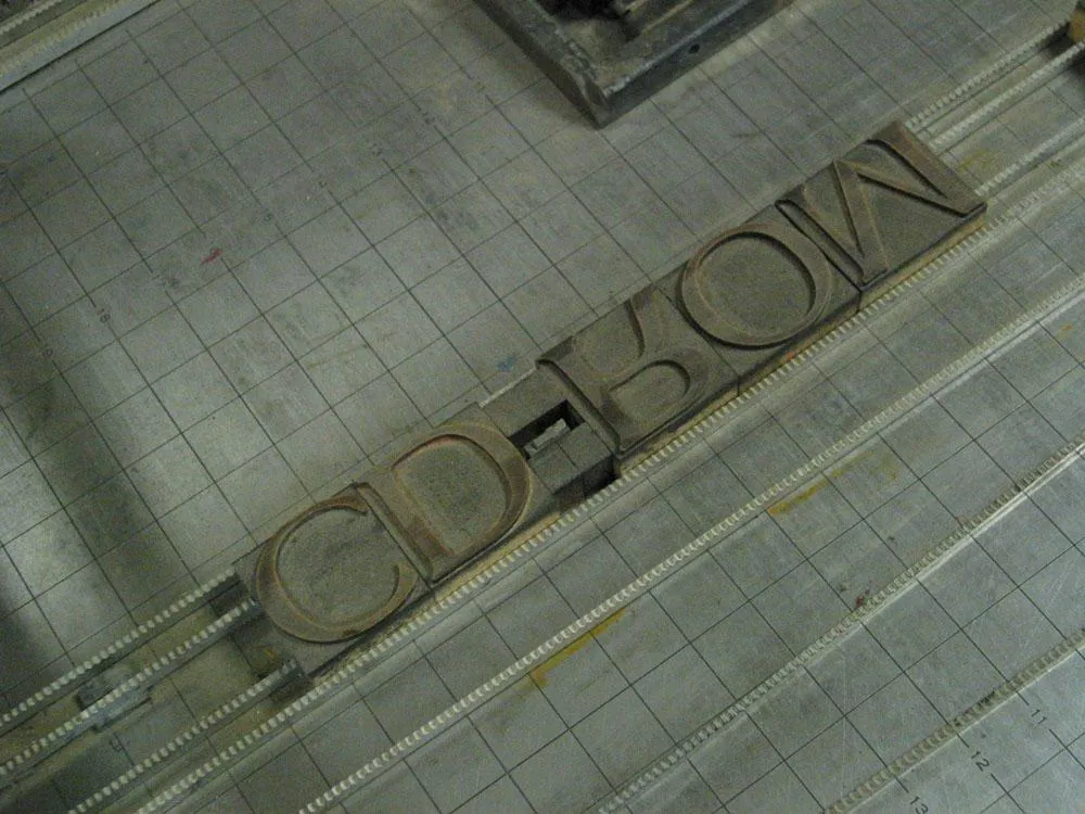
Here is the word “CD-ROM” set up in wood type on a proofing press. I thought this was a bit ironic.
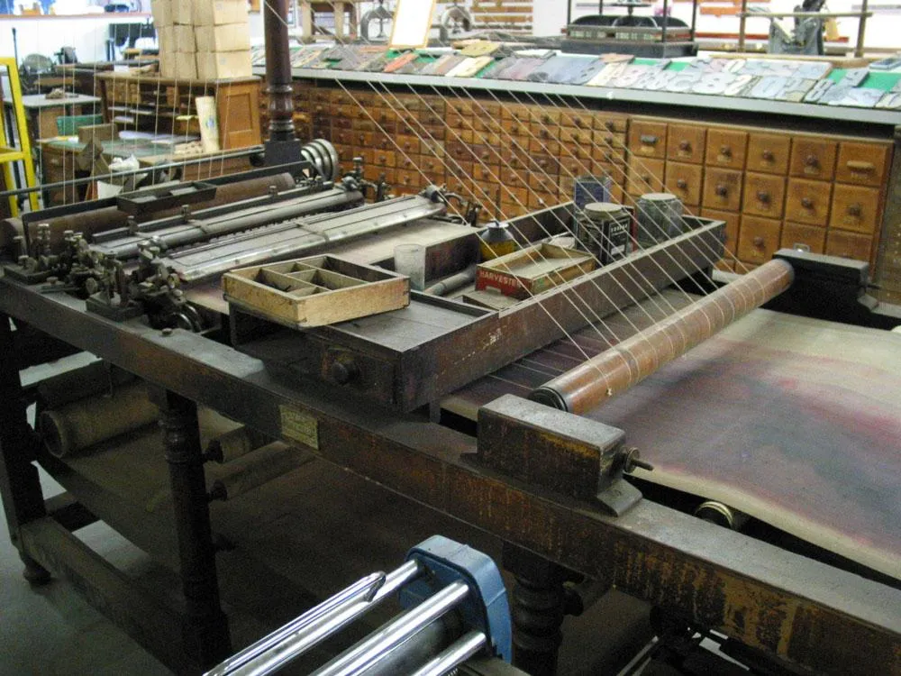
If you ever wondered how they made ruled paper in the old days, this is the contraption that was invented to do it.
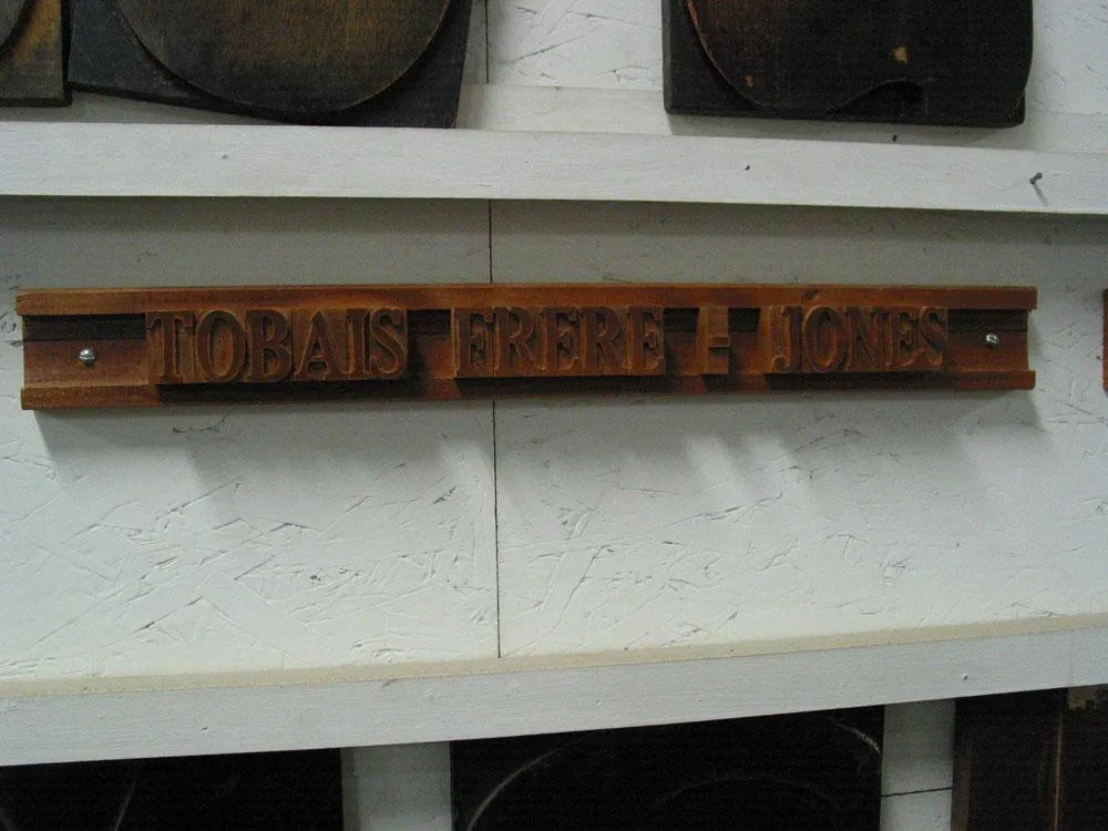
Along one wall in the museum were the names of benefactors set up in wood type. Tobias Frere-Jones, of Hoefler Frere-Jones Type Foundry, was among them. Unfortunately, they spelled his name wrong.
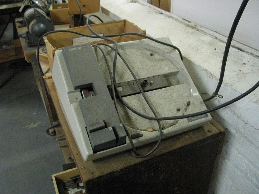
A dusty Kroy lettering machine from the 1970s sat in a corner. Probably they just used it for making labels on drawers.
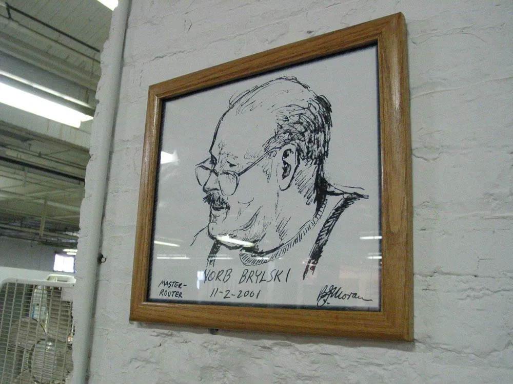
Norb Brylski, our tour guide was honored with a hand-drawn portrait.
This week, the radio program Studio 360 is airing a short interview with Gary Hustwit, director of the documentary film Helvetica. You can listen to it online.
If you haven’t seen the film, I highly recommend it. I saw it at TypeCon in Seattle this last August in an auditorium packed with fellow type geeks. Hard to beat that.
Many of the characters in Helvetica and Arial are very similar to each other, although none are quite identical. Other characters are quite a bit different, and they are the key to telling which is which. Here are some of the most obvious ones (Grotesque 215, Arial’s ancestor, has also been included for comparison):

The “a” in Helvetica has a tail; Arial does not. Also, the bowl of the “a” flows into the stem like a backwards “s”; the bowl of Arial’s “a” simply intersects the stem with a slight curve. (Interestingly, the Grotesque “a” has a tail, just like Helvetica. The bolder weights of Helvetica have no tails, an inconsistency that bothers some people. Maybe it bothered Monotype, too.) Arial’s “a” has always seemed a little badly drawn to me, but maybe it’s just me.

The top of the Arial “t” is cut off at an angle; the Helvetica “t” is cut off straight. You can see clearly here how the x-height of Arial matches Helvetica’s. This is one of the main things that make Arial look like Helvetica at first glance, even though the details are different.

The ends of the strokes of letters like “S” and “C” are perfectly horizontal in Helvetica; in Arial and Grotesque they are cut off at a slight angle.

The “G” in Helvetica has a spur at the bottom of the stem on the right side and the curve at the bottom of the “G” flows into the stem; in Arial and Grotesque the “G” has no spur and the curve at the bottom meets the stem at an angle.

The tail of the “R” in Helvetica flows out from the bowl and curves straight down, ending in a slight curve to the right. In Arial, the tail flows down and to the right from near the center of the horizontal bar and straightens out at an angle to the end. It appears to be a compromise between the Helvetica “R” and the Grotesque “R.” This feature is very unusual for a “grotesque” design, and is more typical of “humanist” sans serifs. It feels out of place here and is one of the more awkward design features of Arial.
Here is the same word set in all three typefaces:


In both fonts, the characteristics described here apply to all weights (except, of course, the tail on the Helvetica “a,” which is dropped on the bolder weights).
See also:
On one of the many times I have visited the Hamilton Wood Type & Printing Museum, I got a peek at the hundreds of “cuts” they had stored in the back. These are large wood and linoleum plates made mainly for posters. Most of them came from Globe Printing in Chicago. I think they had arrived fairly recently when I saw them.
One in particular caught my eye. I recall that it was about two or three feet wide. On one side was this design, obviously intended for use on political posters:
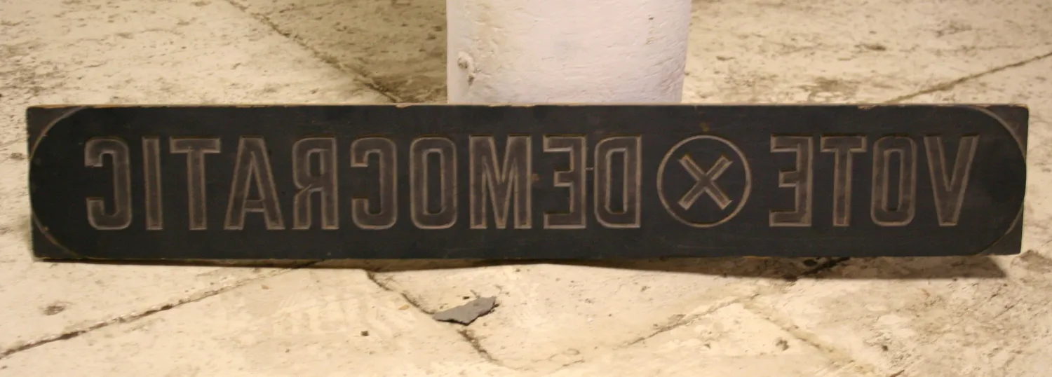
But on the reverse side was this amazing piece of craftsmanship and ingenuity:
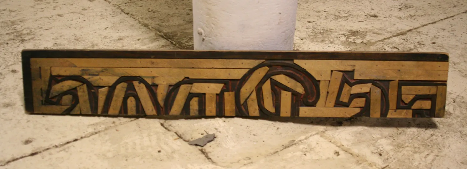
Apparently, cuts were reused when they were no longer needed. In this case, a larger plate was cut down. Not only that, but the open areas were filled in, mosaic fashion, to ensure an even impression for the new cut on the other side. To my eye, the discarded design was the more interesting one. It looks like it read “…ES BROS.” I really like the design of the “B”:
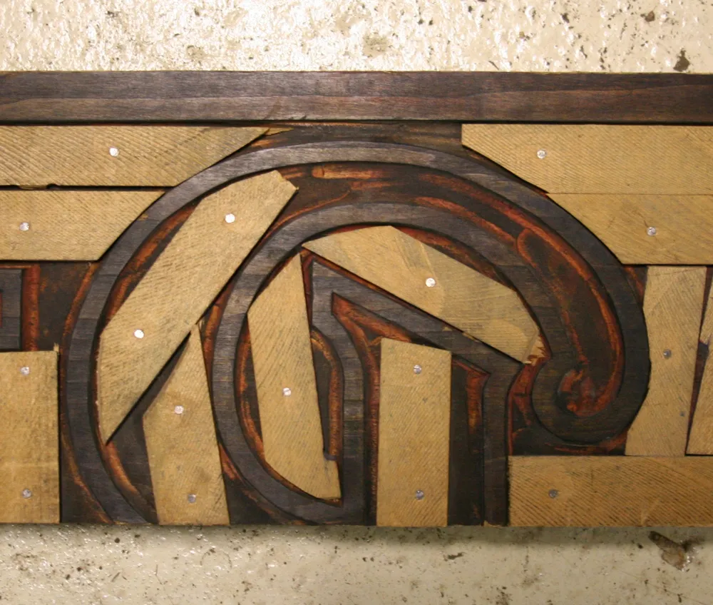
(Photos taken in Two Rivers, Wisconsin, on March 30, 2009.)
Interestingly, Monotype created cheap substitutes for not only Helvetica, but all the other proprietary fonts Adobe has included with PostScript. These were created at the request of Microsoft for inclusion with its PostScript clone, TrueImage, and also included with Windows and Microsoft Office.


Of these other substitutes, Book Antiqua looks nearly identical to Palatino. The designer of Palatino, Herman Zapf, has been known to do off-name versions of his own typefaces for other foundries (notably Bitstream), but in this case he had nothing to do with it, other than being copied. [Interestingly, Microsoft now includes a very good—and fully licensed—version of Palatino with Windows. —MS]


On the other hand, they created substitute fonts for two of his other typefaces, Corsiva for Zapf Chancery and Monotype Sorts for Zapf Dingbats.
As for the others, they are similar to Arial in that they are loosely based on typefaces owned by Monotype reworked to fit the proportions and weight of a specific non-Monotype font.


Century Gothic is Monotype’s Twentieth Century redrawn to match the weight and proportions of ITC Avant Garde Gothic. (Twentieth Century is Monotype’s version of Futura.)


Bookman Oldstyle is the original Bookman (late 19th century, ATF) redrawn to match the weight and proportions of ITC Bookman, including its cursive italic. The original Bookman had a slanted roman for italic.
Century Schoolbook is simply the earlier design upon which New Century Schoolbook is based, which both Monotype and Linotype licensed from American Type Founders. The two are virtually indistinguishable except for the extra weights offered in the Linotype version.
Times New Roman was developed originally by Monotype in the 1930s. Linotype’s Times is actually licensed from Monotype. In this case, the Monotype version is obviously more authentic, though the differences are extremely subtle.
See also:
That “Edikit” image I posted yesterday was just one piece of the whole kit, the only part I still have that’s intact. It’s the cover of a 28-page booklet of half-size layout grids printed on one side of each page in non-photo blue (light blue) ink. The only text is printed on the inside front cover in 24-point Century Schoolbook, centered, capitalization as shown:
**put your ideas
down here because
this is where you
begin.**
And that’s how I actually used it. I did a thumbnail layout on every available page, and sometimes a drawing or doodle on the reverse side, including these typeface ideas, drawn with a red Sharpie on the inside back cover:
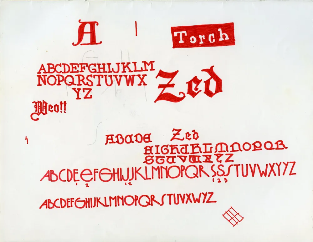
The one near the bottom was probably inspired by seventies art deco faces like Washington or Epic. It even has tiny numbers indicating alternate characters, just like in the specimen books.
Regarding the CCA calendar, I contacted my uncle, Knut Simonson, who I mentioned was a designer at CCA in the sixties. He doesn’t have the red can that the 1968 CCA calendar came in anymore, but he does still have the calendar itself. He shot these two photos of it for me:
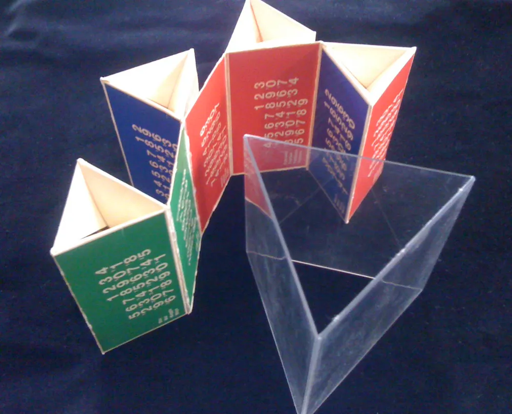
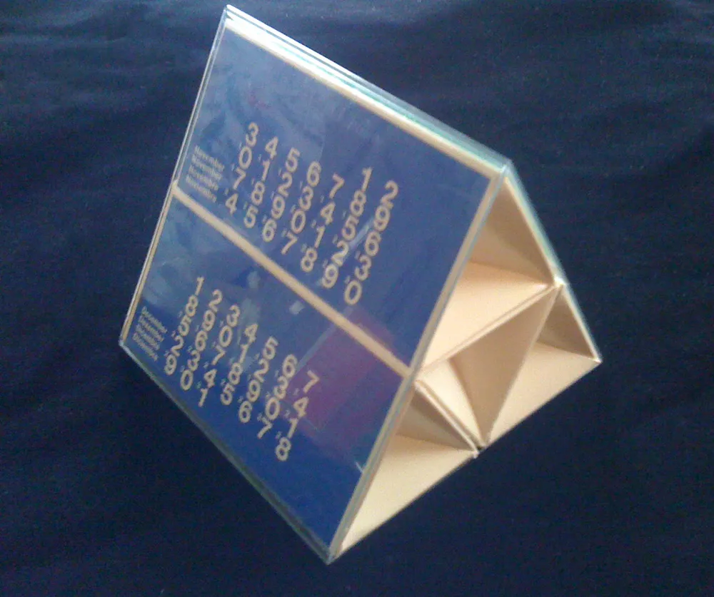
The clear plastic part fit snugly inside the can, and the triangular, paperboard calendar part fit inside that. When assembled, six months are visible on the outside. To see the other six, you slip it out, change the way it’s folded, and slip it back in.
It’s interesting that the ones-place digits are printed much larger than the tens-place digits. I wonder why this was done? To make it simpler and more elegant? It makes the numbers kind of hard to read, almost cryptic. Another case of form over function, I’d say. Overall, a good example of the minimalist way designers still tend to use Helvetica.
Knut doesn’t remember who designed it, but I found some similar calendars done for CCA in the seventies credited to a guy named Bill Bonnell. Maybe it was him. Too bad all the examples are in black and white. Probably scanned from an old design annual, printed back when color was expensive.
