I purposely exempt titles from my nitpicking about anachronistic type in movies. I consider them part of the world in which the film was created, not the world in which the story is set. They may be appropriate or inappropriate, but they can’t be anachronistic.
Nevertheless, it’s one of my favorite parts of watching movies. A friend alerted me to an op-ed in yesterday’s New York Times, Credit Where Credits are Due, about how there ought to be Oscars for movie title sequences. Perhaps, but the lack of an award hasn’t stopped title designers from doing brilliant work.
This reminded me of my favorite site on the topic. The Art of the Title Sequence maintained by a pair of fans, Ian and Alex, who have compiled a growing list of their favorites from movies and TV shows. You can watch most of the sequences in their entirety, some in HD. Many include short articles or interviews with the designers.
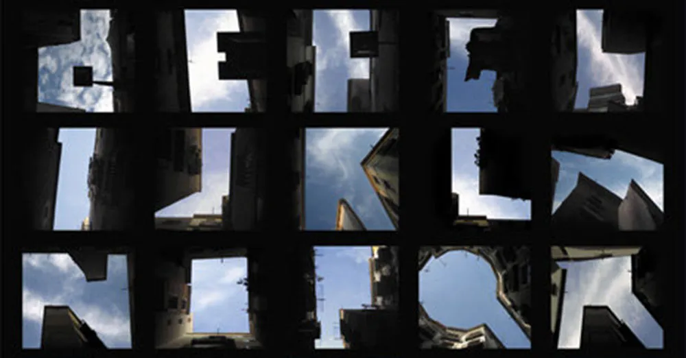
An alphabet made from the negative space between buildings as you look up at them. (From Slanted via Boing Boing.)
Kevin Savetz has just posted MP3 files of the “First Philadelphia Computer Music Festival,” an LP released in 1979 by Creative Computing magazine, on vintagecomputermusic.com. If you are a fan of 2001: A Space Odyssey and have wondered why HAL sings “A Bicycle Built For Two” when he is being disconnected, check out the last track, recorded in 1963.
I just discovered today that my old pal, illustrator Dan Picasso, has a new website. danpicasso.com. Back in the eighties, Dan and I worked together at MPR and later shared an office together as freelancers. We’ve drifted apart since then.
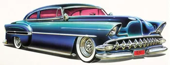
Dan uses a real airbrush in his work—none of this Photoshop nonsense. Most of the works displayed on his site are new to me. He’s done some amazing pieces of lettering design. He definitely had an influence on my taste for lettering and type. And I love the car paintings. I don’t think I’ve seen them before.
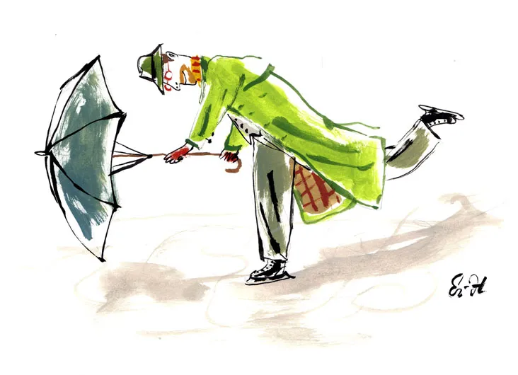
Long-time friend and colleague Eric Hanson has a blog now (ER-H Blog). Eric is an illustrator and writer. I used to hire him quite a lot to do spot illustrations back in my art director days. He just published a wonderful book called A Book Of Ages this last Fall.
Love this whole idea. This is how I set headlines when I was a young graphic designer. No way would I use a pencil, though. Too much risk of warping the sheet. I had a nylon-tipped burnisher, specially designed for the job of rubbing down transfer type. (Via Draplin)
Field Notes: Dry Transfer Edition Instructions from Coudal Partners on Vimeo.
