I discovered Todd Dominey’s What Do I Know [Update: Sadly, it no longer exists] weblog a while back among the hundreds of sites listed on Movable Type’s old Donors’ page (R.I.P.). I thought, “Well there’s an interesting name.” It turned out to be an interesting site, too. I always look forward to reading what Todd has to say. Great links.
I know. Everybody knows about Jeffrey Zeldman’s blog. It’s still one of my favorites. I discovered it when he linked to one of my articles a couple of years ago. He hasn’t been writing much lately due to the fact that he just became a father. I can’t blame him at all, but I hope he manages to drag himself back to his keyboard soon. Closely linked to Zeldman is A List Apart—essential reading for anyone who creates websites.
Illustrator and designer John Martz’s Robot Johnny weblog is a recent addition to my short list. I discovered it when John added my Notebook blog to his links page. Robot Johnny is every bit as fun and interesting as I hope my site is. In fact, it’s a bit eerie how many interests we have in common. I’ve come to realize that on the internet this sort of thing is inevitable.
Here is a cool thing that reader “minusf” wrote to me about recently: A half-hour film made by Chevrolet in 1958 called “American Look.” You can see it, split into three parts, on YouTube the Internet Archive:
It’s pretty heavy on pro-America/pro-Chevy propaganda, but it’s also a revealing glimpse into a world when most everything was still designed with simple art materials like pastel crayons and clay.

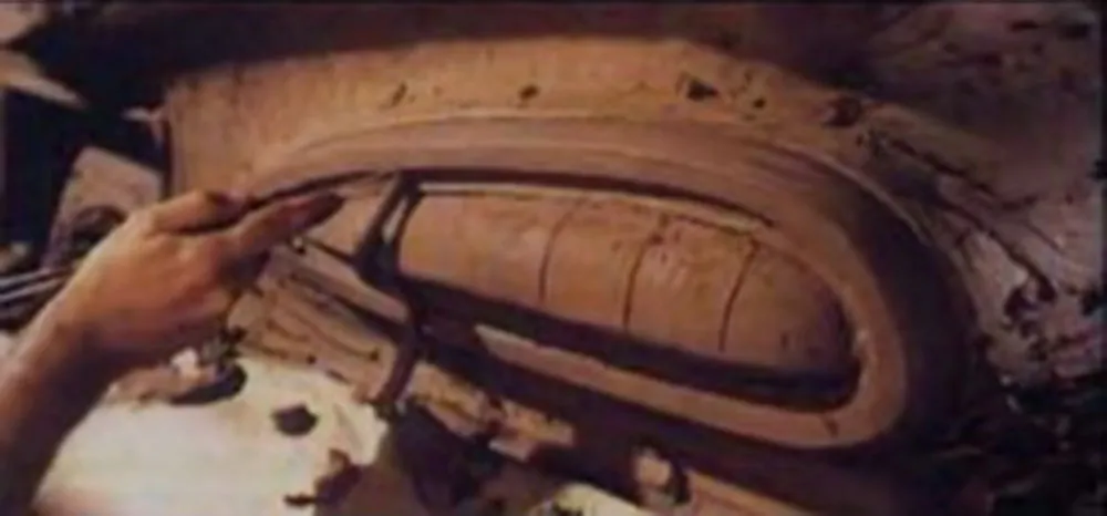
In the third part, they build a design prototype of a ’59 Chevy out of plywood and clay. This was the car my family had when I was a little kid. To me it looked like a scary, angry animal. Little did I know they were going after “sleek and stylish.”
The pre-Fifties world seems to have been erased in the film. People live in thoroughly modern houses, have thoroughly modern furniture and appliances, and work in thoroughly modern buildings. Nothing old seems to exist.
I must have seen a lot of propaganda like this when I was a kid. I fully expected that the world would look like this when I grew up. But in reality, old and new have always lived side-by-side, and probably always will. (I love it when films that are set in the future, like Blade Runner, get this right.)
A lot of the design in the film still holds up well, like the Eames chair. But every now and then they show something that looks utterly old-fashioned—unsurprisingly, anything to do with electronics, appliances and business machines, which have changed radically over the last fifty years. On the other hand, the design requirements for chairs, spoons, and drinking glasses are pretty fixed.
(Thanks to John Blair for finding these videos on the Internet Archive. When I originally wrote this, the videos were up on YouTube, but at some point they were removed. Thanks to John, I am able to link to them again.)
AIGA New Orleans has posted a really cool video on Vimeo: A slide show from 1962 created by the Art Directors and Designers Association of New Orleans (now an AIGA New Orleans). The pace is almost painfully slow by today’s standards, but patience yields a fascinating glimpse into the design world of the early 1960s.
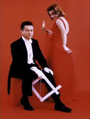
Several things caught my eye as I watched it, including two Filmotype typefaces I recently revived: Ginger (at 4:43) and Glenlake (at 14:16). But I did a double take, and then a triple take when I saw this slide (at 30:52):

First of all, it looks like a White Stripes CD cover.
Second, the gizmo in the guy’s hand is a Scaleograph, an aid for sizing photos and art that was commonplace before computers made their way into design studios.
Third, according to the narrator, the guy in the photo, New Orleans designer Bob Brandt, invented it.
I still have one of these once handy gizmos hanging in my office for sentimental reasons. Sure enough, in small print it says: MFD. BY THE BRANDT CORP., NEW ORLEANS, LA.
Cool.
Jean-Christophe Loubet del Bayle has just posted an interview with me on the French typography webzine, Planet Typography. (Si vous préférez le lire en français, voici l’interview et le webzine.) (I had no idea I could speak French so well.)
Ever notice how the font name “Arial” looks like a certain other word sometimes? (Via DaughterNumberThree)

