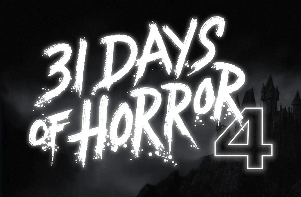
This was a fun one. Rumsey Taylor of Not Coming to a Theater Near You asked me to create lettering for a splash page graphic for the site’s fourth annual horror film festival.
The idea was to emulate classic horror film title screens. Thanks to Steven Hill’s Movie Title Screens Page I was able to find loads of reference. At first I was thinking I would use some kind of blackletter style, but it turns out almost no horror films use that style, unless they involve Dracula or Frankenstein. (More often it’s used for pirate movies.)
In the end I decided to go with the classic scrawled-in-blood look. To get the effect, I wrote out the letters freehand using a Wacom Cintiq and Corel Painter. It took a lot of experimentation and “takes” to get the right look. Once I had the basic lettering, I enhanced it in Illustrator and Photoshop to get the look of an old black and white movie title, complete with light-spill on the brightest areas.
I’ve been using a Mac for all my design, illustration, lettering, and type design work since the mid-1980s. I embraced it fully and enthusiastically, before it was really even ready sometimes. It made so many things easier and faster. Why would you ever go back once you had experienced the power of “undo”?
I grew up in the analog world, the time before ordinary people had access to computers and digital technology. The most high-tech things in my life were television and the space program (which I saw mainly on television).
The kid who could draw
When I was young, I drew a lot. I had my first piece in a public art show when I was in kindergarten. Sometimes, my first-grade teacher would let me stay inside and draw instead of going outside for recess. When I was in 4th grade, all five of my entries in a Post Cereal drawing contest won prizes. That year, I also started taking oil painting lessons. By the time I was in high school, I was very good at drawing, cartooning, and painting. I consistently got A’s in art class, won awards, and was clearly heading for some kind of career in art.
I majored in art and graphic design in college and initially had ambitions to become a commercial illustrator, given my talent for drawing. But graphic design, lettering—and even type design—also appealed to me. In my first job out of college, I was hired as a graphic designer at a small advertising art studio. I also did illustration jobs on the side for local magazines and newspapers in Minneapolis. My career soon veered into magazine art direction, where I hired illustrators, and my illustration career never really took off.
The digital world
After I bought a Macintosh in 1984 and started using it for creative work, I found myself using the analog tools I grew up with less and less. All the tricks and techniques I’d learned as a young artist were becoming obsolete very quickly. I was drawing less, painting less, and, without realizing it, taking those skills for granted. I could still do it if I wanted to, I told myself.
I tried using graphic tablets, attempting to transfer some of those skills into making art on a computer. Whatever the reason was, drawing on a tablet has never felt the same to me. The immense flexibility and power of computer graphics software has always has felt impoverished and ephemeral next to the richness of physical art tools and media.
Even so, I turned my back on the old ways and embraced the digital.
Admittedly, this has worked out very well for me. I wouldn’t have succeeded as a type designer any other way.
But, as time went by, not just my work, but more and more of my life (and almost everyone’s life) became centered on the digital world, especially with the rise of the internet, and the always-on internet. And with the iPhone, the always-with-you internet. And now they want to put it right in your field of vision with VR/AR, and ultimately a chip in your head. The digital world seems hell-bent on supplanting the physical world.
This used to sound “cool” to me. It seemed like the logical path in human-computer interaction. But I’m not so sure anymore.
We’ve been accepting all this, little by little, because of the convenience. Each step of the way, it’s “so much easier” than the old way. Everything in the world at your fingertips. All the music, all the movies, all the shows, all the art, all the time. Make a mistake? Undo! Change your mind? Redo! Dropped your laptop in the lake? No problem. It’s in the cloud!
But at what price?
I’ve become increasingly skeptical of the digital world as a healthy or desirable place to spend time. Not to mention all the tracking and surveillance that has crept in, the psychological damage of social media, and the rise of “subscription” models where you have to pay for an app indefinitely to maintain access to your documents.
I’ve also grown wary of how much time I spend sitting in front of a computer screen, even for doing creative, useful things (as opposed to YouTube, social media, or other time-wasters). As I get older, time is getting more precious to me. Do I really want to spend it sitting and staring at a screen?
Reconnecting
Getting back into drawing has been on my to-do list for a while. Maybe 20 years. I felt like I was letting my drawing talent waste away, rarely using it anymore. I was spending more time watching videos or reading books about drawing than actually drawing. I tried different things over the years (including joining a group that gets together once a month to draw cartoons), but nothing seemed to work in any sustained way. It’s almost like I’d given up, but didn’t want to admit it to myself.
But recently, I heard about a book called *The Artist’s Way,*by Julia Cameron. One of the things she recommends is to write “morning pages” first thing every day. Most of the rest of the book didn’t really seem to apply to my situation, but this “morning pages” thing got to be a habit, and got me thinking more deeply (through the writing) on improving my relationship with “screens” and getting back to drawing regularly.
1979
One of these insights revolved around the year 1979. In my mind, that year signifies the twilight of the analog world, just before the dawn of the digital era. Things in my 1979 world were entirely analog.
I was 23 years old. The tools of my craft were T-squares, rubber cement, ink, Zip-a-Tone, technical pens, X-acto knives, ellipse templates, markers, illustration board, dividers, Letraset, photostat cameras, and phototypesetting. I listened to music on a Pioneer turntable and a JVC AM/FM receiver. I watched TV on a 13” Panasonic. Cable TV and VCRs weren’t really a thing yet. My telephone was connected to the wall. If I was away from my apartment, I was unreachable. My apartment was filled with inexpensive furniture I’d made myself (thanks to the books Instant Furniture and Nomadic Furniture) I designed and built my own desk/drawing table. I had a 35mm camera and a Polaroid SX-70. I had books and magazines to educate and entertain myself. And a guitar. If I need a photo reference in order to draw something, I’d go down to the picture section at the Minneapolis Public Library.
It might sound terrible to someone who has never known life without the internet, but I miss it. I miss not being surrounded by things trying to get my attention. I miss the simplicity of the way things used to work. You learned to find your way around. You didn’t need GPS. Doing art was a physical, direct, visceral experience—even commercial art.
Don’t get me wrong, I wouldn’t actually want to live that way now. I love technology and gadgets, and all the things they can do for me. But thinking about what things were like in 1979 reminds me that life is perfectly possible without all our modern “conveniences” and their hidden costs and unseen consequences. For instance, my old drawings and artwork could be lost in a fire or flood. But they may well still be around hundreds of years from now, and they won’t need any special device or software to be seen. Whereas my PageMaker files from 1995 are already virtually inaccessible (I have ways, but you get the point). Not to mention degradation of digital media over time, rendering the contents of disks, hard drives, and SSDs unreadable sooner or later.
I’ve come to realize the value of making physical things, the richness of analog art vs. the weightless, scaleless, ephemeral nature of digital art. I’m obviously not the first person to think this. There are books about it. But the trade-offs of the digital world have been growing larger in my mind.
Drawing again
Another insight from my “morning pages” has been discovering a way to trick myself into drawing again. I have a habit of listening to podcasts or videos. Basically, draw at the same time—piggyback on that habit. It’s so simple, I don’t know why it never occurred to me before. I guess I had in my mind that I needed to devote time to do draw, and only draw. And I could never quite make the time. Something else would always seem more important or easier.
But it worked, and now I’m drawing again every day. The old confidence is back (which I didn’t even realize had gone) and it’s been very satisfying. Lack of undo actually increases the enjoyment. Things are at stake. Getting to the end of a drawing without undo is immensely rewarding.
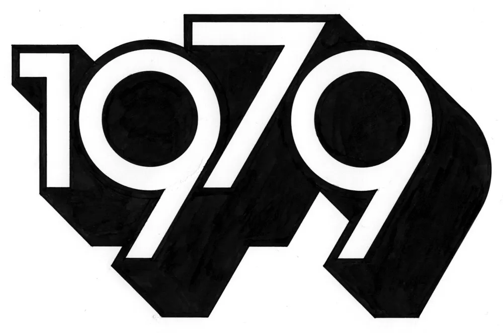
And I’m spending less time staring at screens. In fact, I thought of a way to remind myself to get into “1979 mode.” During my drawing session the other day, I designed and lettered the year “1979” in a style similar to lettering I was doing back around 1979. And I did it only using tools that were available to me in 1979 (yes, I still have them): pencils (for the sketch and the under-drawing), erasers, illustration board, masking tape to hold the board down, circle template, dividers, ruler, triangles, Ulano Glide-Liner (like a T-square, but attached to the table), Higgins Black Magic ink, a Koh-I-Noor Rapidograph, a fine sable brush, and a bit of white water color paint to fix some mistakes.
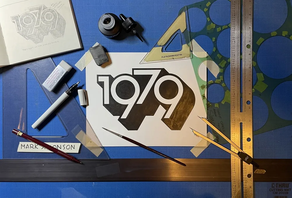
It took about two hours in all—10 minutes to do the sketch and the rest to render it. On my Mac, I could have done the whole thing in a couple of minutes—and with no mistakes. But it would have been much less satisfying when I was finished. And I’d be tempted to fiddle with it endlessly.
So, now I have this little bit of lettering tacked up on my wall to remind me to keep things real, to get my head out of cyberspace once in a while and connect with reality. To remind me I don’t need a computer to draw a picture. I just need some paper and a pencil.
The digital world has its place. You can do amazing things in it (like publishing a blog post). But don’t spend all your time there. It’s not the real world.
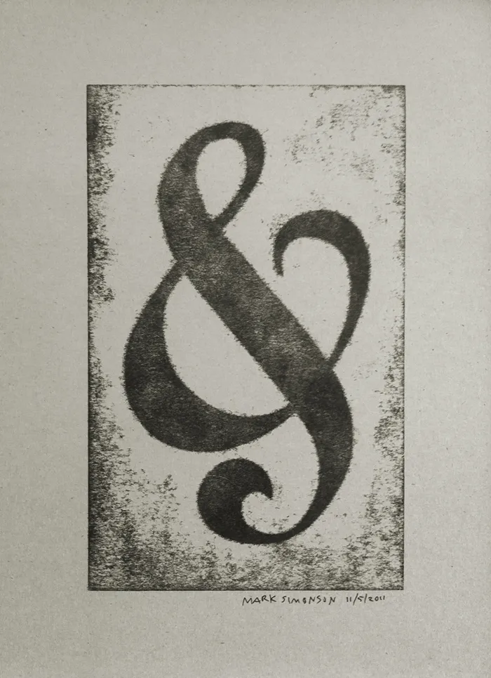
I’ve attended all three of the Hamilton Wood Type and Printing Museum’s annual “Wayzgoose” events so far. Last year’s, held in early November, was enjoyable as always, but I think I prefer the mix of presentations and hands-on workshops of previous years over having only workshops.
Still, it was great how they tied all the workshops around a common purpose—creating a portfolio of prints (including the portfolio itself). You can see one of my prints above, a pressure print from a hand-cut plate based on a free-form ampersand design.
I highly recommend the Wayzgoose if you are a type fanatic like me, into letterpress printing, or both. It’s held in the Fall in Two Rivers, Wisconsin. Attendance is limited, and it fills up quick, so you might want to get on their mailing list to be notified regarding when the next one will be held.
Most of the calligraphy I’ve done was way back in college when I was studying graphic design, and very little since then. I’m just not that into it, which may seem strange coming from a type designer, but to me they are completely different things. Being good at one doesn’t necessarily make you good at the other; sometimes quite the opposite, I think.
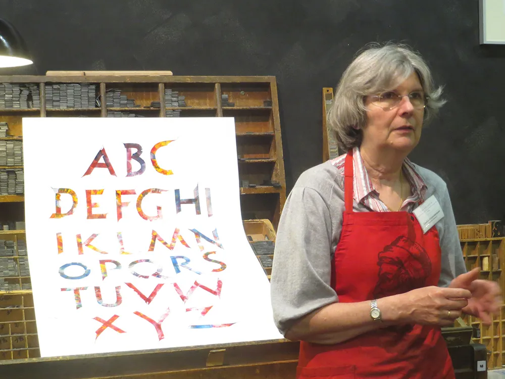
In spring of 2013, I went on a tour through Europe with about a dozen other type and printing geeks called Travels In Typography. When we visited Mainz, Germany, home of Johannes Gutenberg, father of movable type, we had the pleasure of meeting Gundela Kleinholdermann (pictured above), who is a volunteer at the Gutenberg Museum’s Druckladen (“print shop”). Her specialty is what she calls roller calligraphy. Instead of the usual brush or pen, she uses inking rollers, the kind you use to ink a letterpress proofing press.
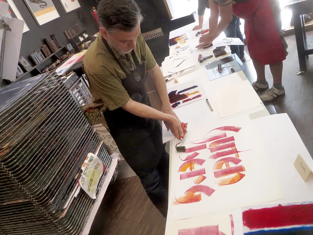
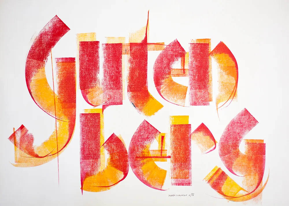
Inking rollers come in all widths, but what they have in common is that only a narrow strip of ink across the width of the roller touches the paper at any one time, not unlike the edge of a broad-nib calligraphy pen. But instead of inking plates or type, Gundela makes letters. And she’s amazingly good at it. With some of the examples she showed us, it was hard to believe they were made with such an unlikely tool.
The technique involves manipulating the roller as you move it across the paper, turning it, dragging it and—this is the tricky part—lifting one end of the roller to get a tapered effect. You can also touch the paper without rolling to create a line. There are no rules, just whatever works. You can tell that Gundela has been practicing and experimenting with this for a long time. She’s a virtuoso roller calligrapher.
After showing us the basic techniques, we got a chance to try it ourselves. As I said, I was a bit reluctant at first, but it started coming back to me. For someone who was “not into” calligraphy, I really had a lot of fun with it.
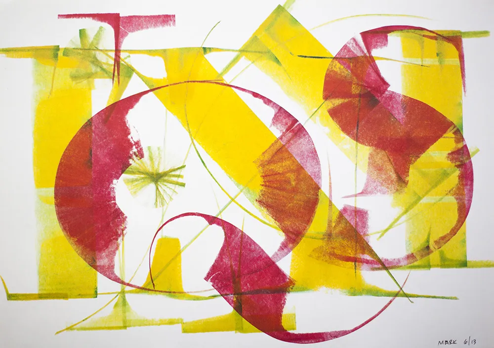
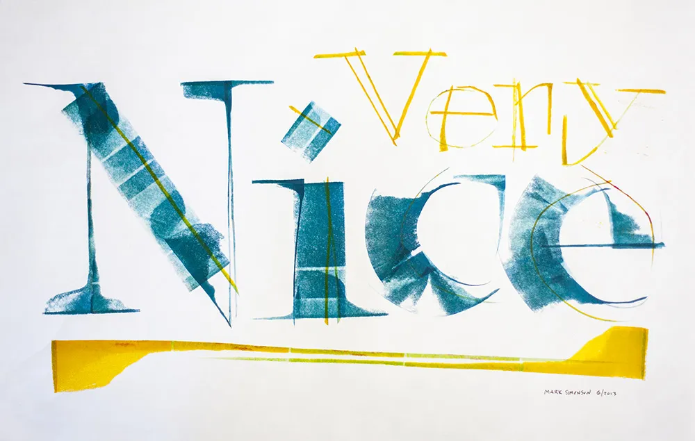
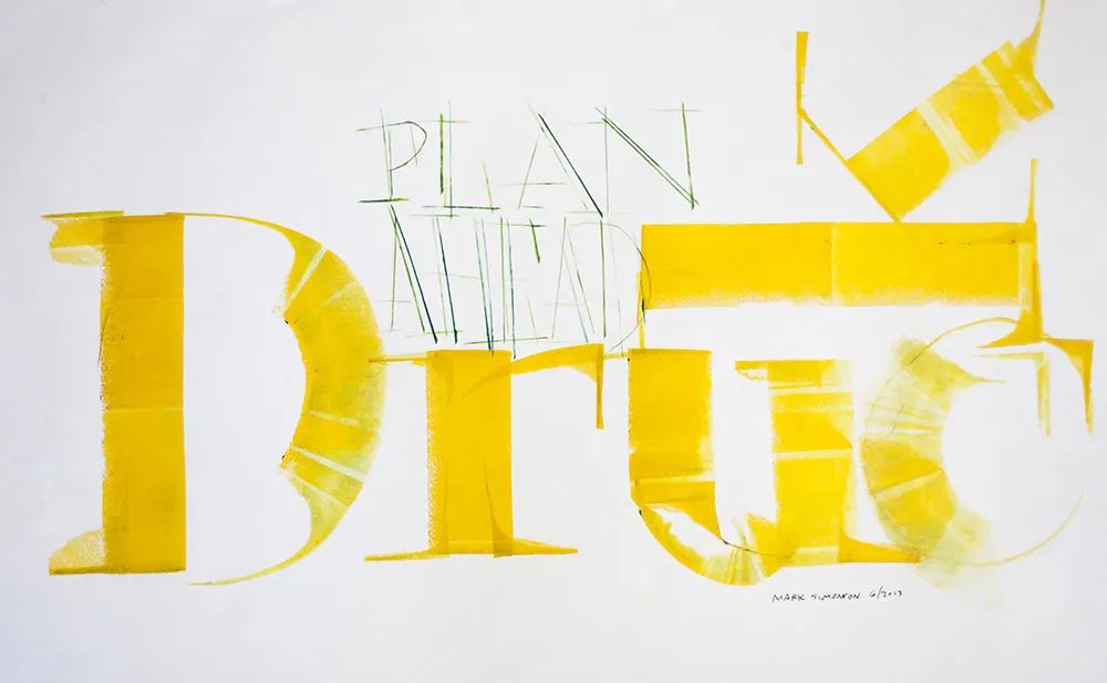
A version of this article appeared on the Hamilton Wood Type & Printing Museum website in April, 2014. Thanks to Bill Moran for encouraging me to get off my ass and write this.
I recently completed work on a lettering design for the front of a building in Ketchikan, Alaska. The letterforms were based loosely on historical examples from the area. Traditionally, sign makers would fill as much space as possible, using the slats or runs of bricks as a grid on which to build the letters. The shapes of the letters themselves, while following standard styles and practices, often displayed idiosyncrasies unique to each sign maker, unlike today when most such signs are made with off-the-shelf fonts, typed on a computer keyboard, and “output” to a vinyl cutter.
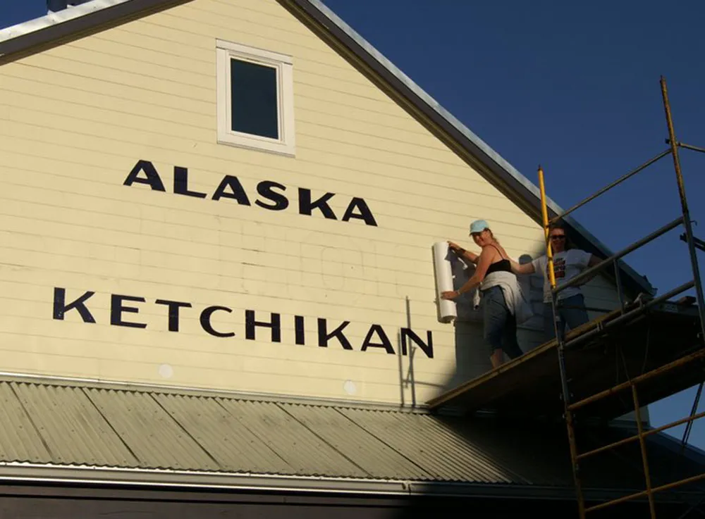
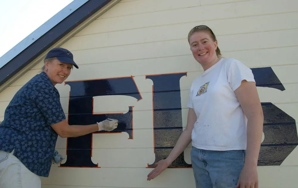

Although I do my final artwork electronically, the letters were designed from scratch with paper and pencil. The finished design was sent to Ketchikan where local sign painters (above) applied my design to the building using traditional techniques—real paint and real brushes. According to the client, the sign has become a “photo op” for tourists.

(Photos courtesy Deby Slagle, Alaska Fish House. Used with permission.)
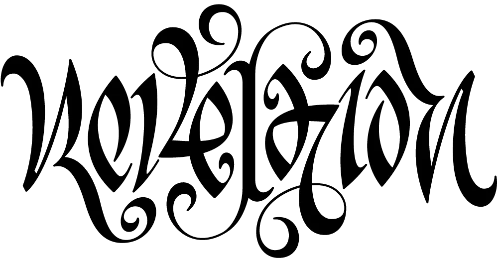
I’ve never designed a tattoo before, and not many ambigrams, either.
An ambigram is a form of lettering in which a word or phrase can be read in more than one direction. Or it may be two words combined into one image in which only one can be seen at a time, depending on how you look at it. The master of this art is John Langdon whose 1992 book Wordplay showcased his work. (A new edition is in the works.)
The design above was for a tattoo and was commissioned by a client in Canada. It reads the same if you rotate it 180°. (I don’t know where she had it placed, but she promised to send a photo.)
Ambigrams are partly luck, partly skill. I feel lucky it turned out as well as it did. I hate to think of someone permanently dyeing their skin with a design that didn’t quite work.
