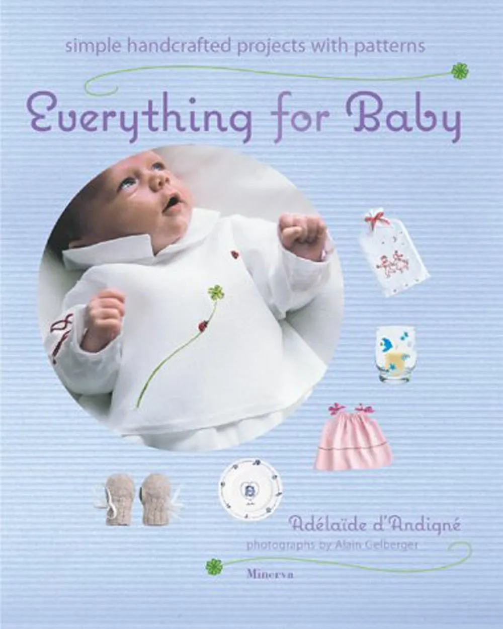
I recently noticed Coquette used extensively in the book “Everything for Baby” by Adélaïdé D’Andigné and Alain Gelberger, published by Stewart, Tabori & Chang last year. Notice how the baby in the photo seems very interested in the font. Obviously, a budding typophile.
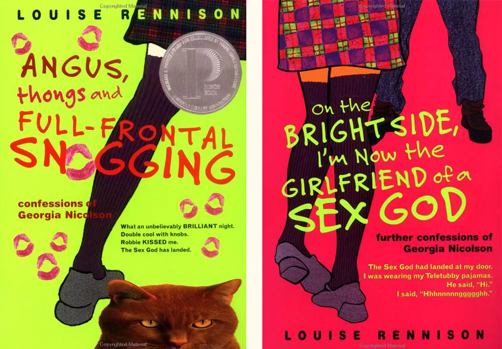
Felt Tip Roman is being used very effectively on this series of young adult novels by British writer Louise Rennison. There are at least five of them, but these two are my favorites.
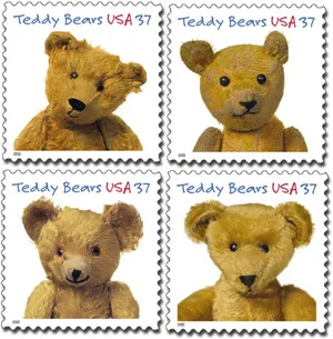
Imagine my surprise when I saw my face at the Post Office. Typeface, that is. A very prominent use of Felt Tip Roman.
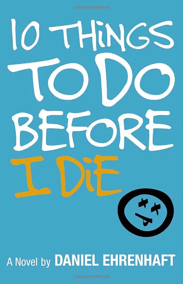
There must be something very “teen angst” about Felt Tip Roman. It keeps showing up on teen fiction titles like this. Looks good, although I see they didn’t like my cap I.
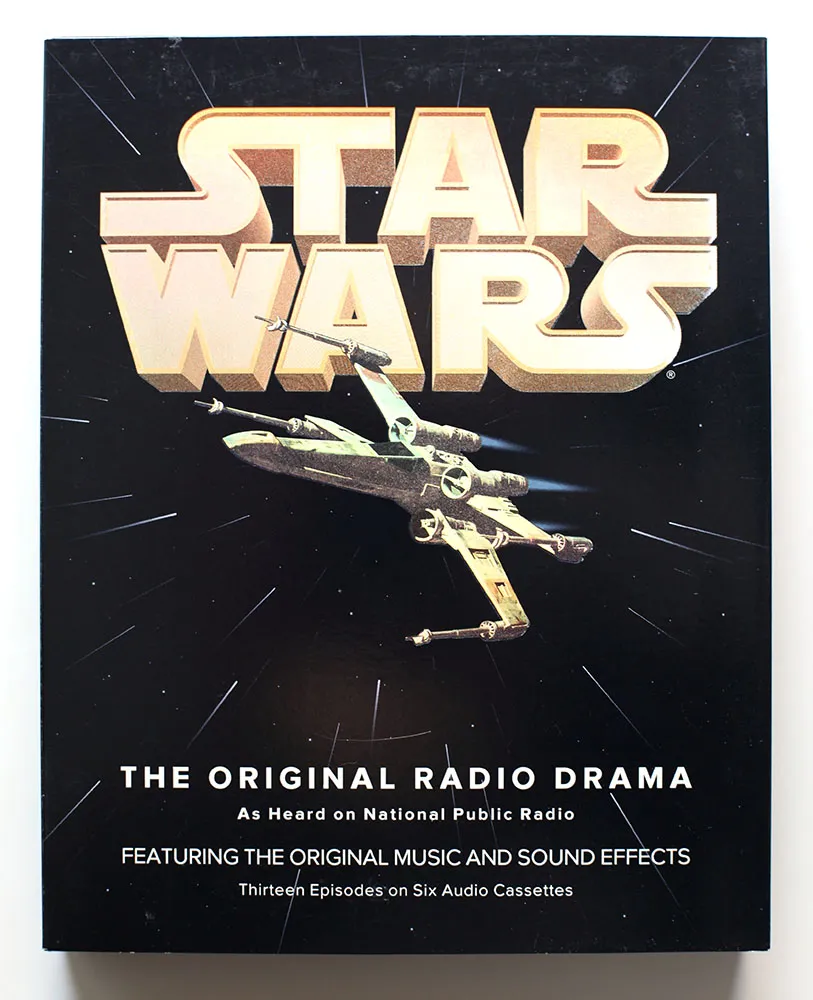
Back in 1993, I had just started a job at Rivertown Trading Company as a graphic designer. Part of that job was to design packaging for a division of the company called HighBridge Audio. One of the most interesting titles I got to work on was *Star Wars: The Original Radio Drama,*which had been broadcast on National Public Radio in the early eighties and was being released for the first time on audio cassette. (CD came later.)
It was one of the most elaborate packaging projects I ever worked on, with complicated die cutting and holographic foil embossing on the cover.
While working on the project, I was flown out to Skywalker Ranch near San Rafael, California, home of Lucasfilm, to rifle through file drawers of 35mm slides for possible use on the packaging. (My flight was delayed, so I missed out on having lunch in the same room as George Lucas.) Considering the rich visual imagery of Star Wars, it was surprising how little suitable photography they had for us to use. The complex visual effects only existed in the film, not in the publicity shots, which were taken on the set for the most part. The “stills” of, say, an X-wing fighter flying over the Death Star only existed as crudely retouched photos.
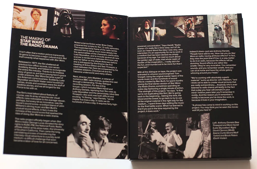
Back then I was also working an early version of Proxima Nova, which at the time I was calling Visigothic. I had tried some different fonts for the Star Wars packaging, including ITC Avant Garde Gothic and News Gothic, but nothing looked quite like what I wanted. On a whim, I tried Visigothic. It was plain (like News Gothic) and also a bit geometric (like Avant Garde). It felt a little weird using my unfinished type design for the project, but it seemed to work. I showed it to the other people I was working with and they thought so, too. So I used it.
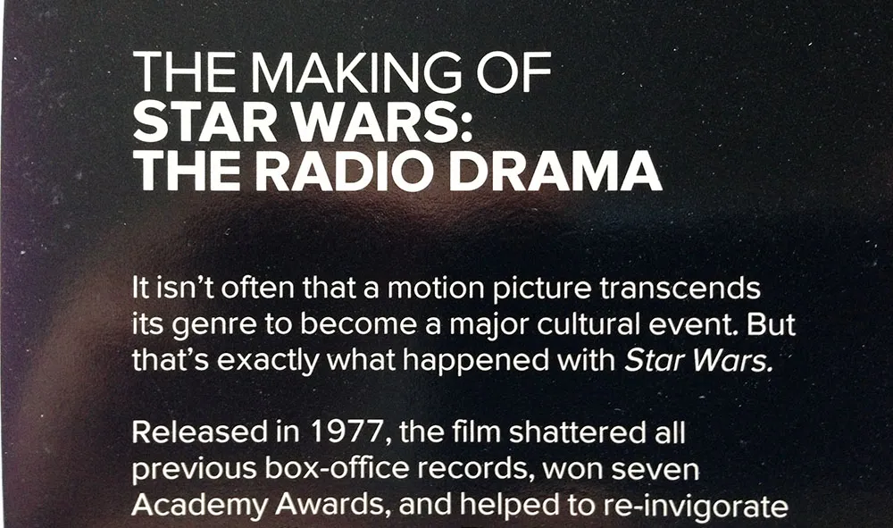
I released the fonts about a year later as Proxima Sans. The version on the Star Wars packaging is fairly close the final version, although you can see from some of these images that the kerning was not quite finished. Also, the italic was just a simple slant of the roman, but with a modified lowercase “a”. Some other differences: the lowercase “y” has a longer tail and I hadn’t done the ligatures yet.
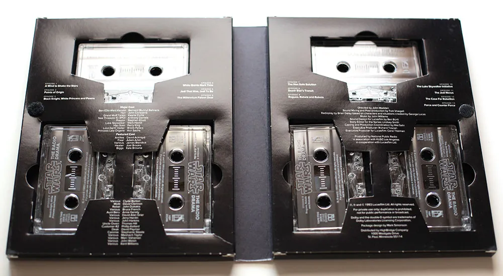
Someday, this font would become Proxima Nova, but this is the first time it was used publicly. It was exciting for me at the time to see how it performed in the real world, and it made me confident that it was worthy of releasing commercially.
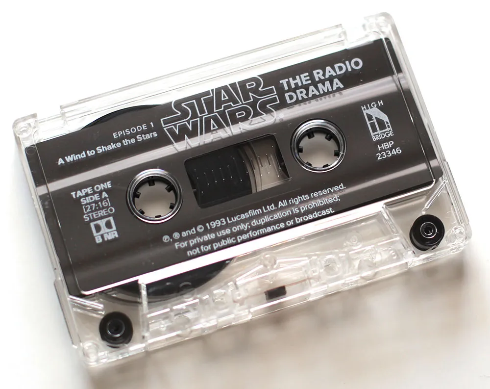
If you ever wondered why Proxima Nova includes a ℗, now you know. On the CD version of the series, which I did in the late nineties, I used Proxima Sans, and I believe HighBridge has used Proxima Nova for more recent incarnations.
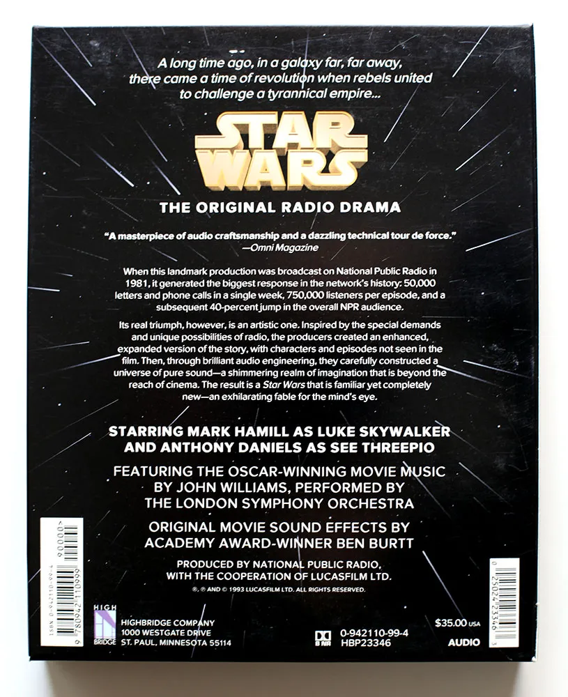
I created the 3D version of the Star Wars logo and the “hyperspace” star pattern in Adobe Illustrator and a program called addDepth. What I remember most about working on this project was how excruciatingly long it took to preview the artwork on the primitive Mac IIcx I had to work with at the time.
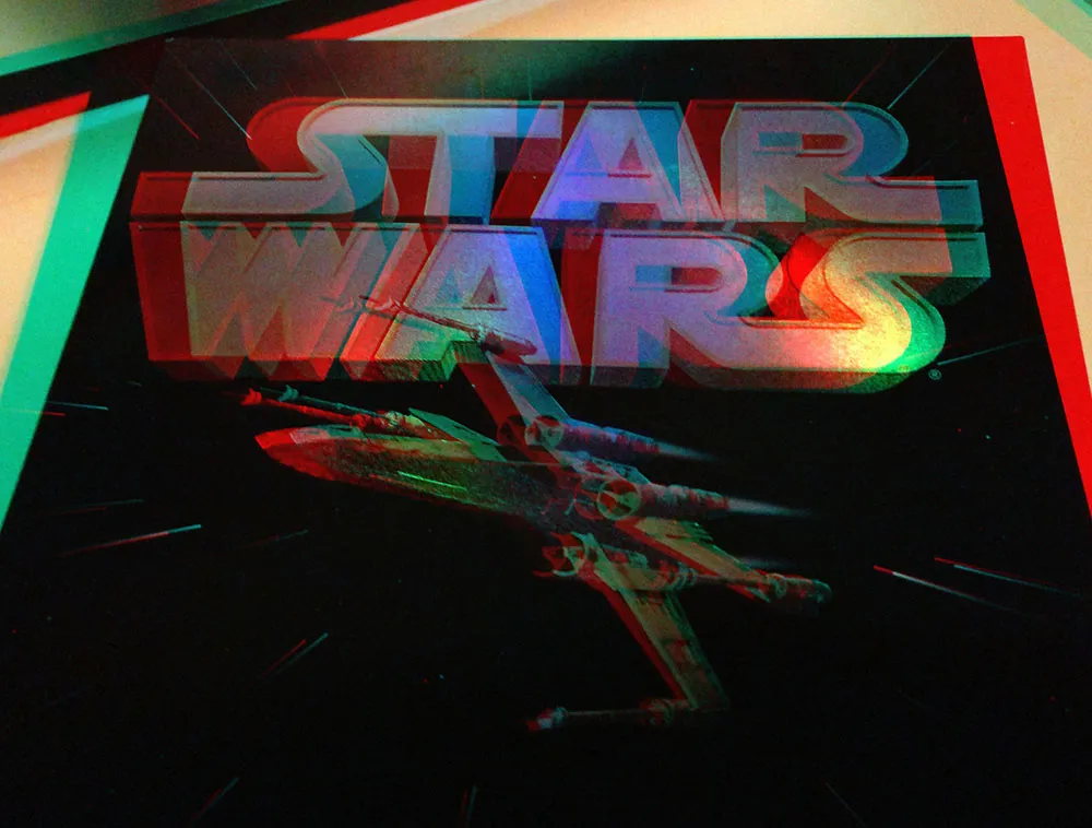
If you’ve got a pair of anaglyphic glasses (red/blue), this will give you a better idea how the holographic foil stamping looked.
Ever since I started Notebook, I’ve been occasionally posting “font sightings” and I even have a special category for them. It worked okay, but the samples I’ve posted here have been kind of small, and I thought it would be really neat if, somehow, all the Coquette sightings could appear on the Coquette page, for example.
For a while I’ve had this idea of using Flickr as part of a new and improved Font Sightings system. I finally stopped thinking about it and did it. It was actually pretty easy, if a bit tedious.
I already had about a bunch of photos of font sightings in Aperture, and I picked about a hundred of the best ones. After spending some time naming and tagging them, I used the Aperture Flickr upload plug-in to get them all up on Flickr.
The second step was to add some special code (from Flickr) to the font pages and Notebook to display a set of three random sighting and provide a link to the appropriate photos on Flickr (see the top of the column to the right).
So far, I’ve only uploaded what I already had in Aperture. I still need to add all the stuff people have sent me over the years (thanks to all who have), plus all the stuff I don’t have photos of yet. Some fonts aren’t yet represented mostly because I didn’t have sightings of them in Aperture. These will be coming soon. Some of them, like the newer ones and poor old Sharktooth, I’ve just never seen used yet.
From now on, new font sightings will appear on Flickr and (randomly) on the right-hand column of Notebook and the font pages. The “Font Sightings” category for Notebook is basically dead. Long live Font Sightings!
If you have seen any of my fonts out in the wild, or maybe have created designs using them, feel free to send photos or scans to mark@marksimonson.com.
