For some reason, a high percentage of sightings of Acme Gothic in use have been in science fiction movies and TV shows. Not what I would have expected at all for what I admit is a somewhat “retro” typeface. Then again, Bank Gothic, released in 1930, is super popular for futuristic sci-fi uses.
Here are the examples I’ve spotted so far:
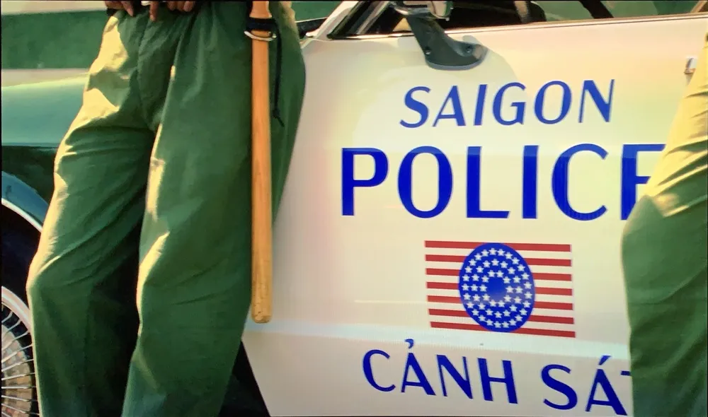
In a brief shot in the HBO series Watchmen, Acme Gothic Wide Regular can be seen on the side of a Saigon police car it its alternate timeline of 2019 where Vietnam is the 51st U.S. state. Lucky thing I included Vietnamese diacritics.
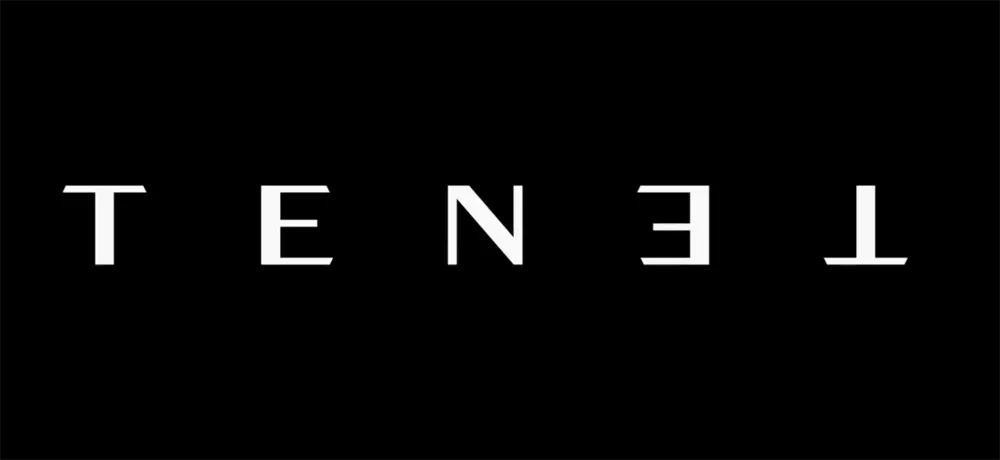
Acme Gothic Extrawide Regular as seen very widely spaced in the first trailer for Tenet. The rotated palindrome concept was dropped for a straight treatment after it was discovered that there was a bicycle company called Tenet that had already used the same idea in their logo. Happily for me, they kept the Acme Gothic for the revised branding.

In what appears to be a spin-off of the Mandalorian Disney+ series, the logo for Star Wars: Rangers of the New Republic features Acme Gothic Extrawide Regular like Tenet, but much more tightly spaced with a brushed metal treatment.
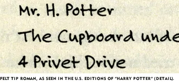
As noted on the sample page, Felt Tip Roman has been used in the U.S. editions of the Harry Potter books to represent the handwriting of the character Hagrid. I’ve always thought this was kind of cool, and it makes a nice example when trying to talk about type design with people who have never thought about where fonts come from.
Over the weekend, I was shocked to learn that there is a free font, distributed by many of the Harry Potter fan sites, purporting to be “Hagrid’s handwriting.” After checking it out, I was relieved to discover that it is not a pirated copy of my Felt Tip Roman, but a rather poor imitation.

As you can see, it looks more or less similar, but is clearly not Felt Tip Roman. Looking at it more closely, it appears that the person who did it must have copied the letters with a pen by eye (making up the ones she didn’t have samples of), scanned them in and had the computer autotrace them. (Felt Tip Roman was hand digitized, not autotraced.)

I guess I don’t mind fans using this imitation font. At least they are not passing around bootleg copies of the real thing. But if you do want the real thing, remember: It’s not a free font, and never has been.

Minnesota Eats Out, by Kathryn Strand Koutsky and Linda Koutsky, was published recently by the Minnesota Historical Society Press. This really enjoyable book features two of my fonts: Blakely is used on the cover and for running heads inside, and Coquette is used throughout for initial caps.
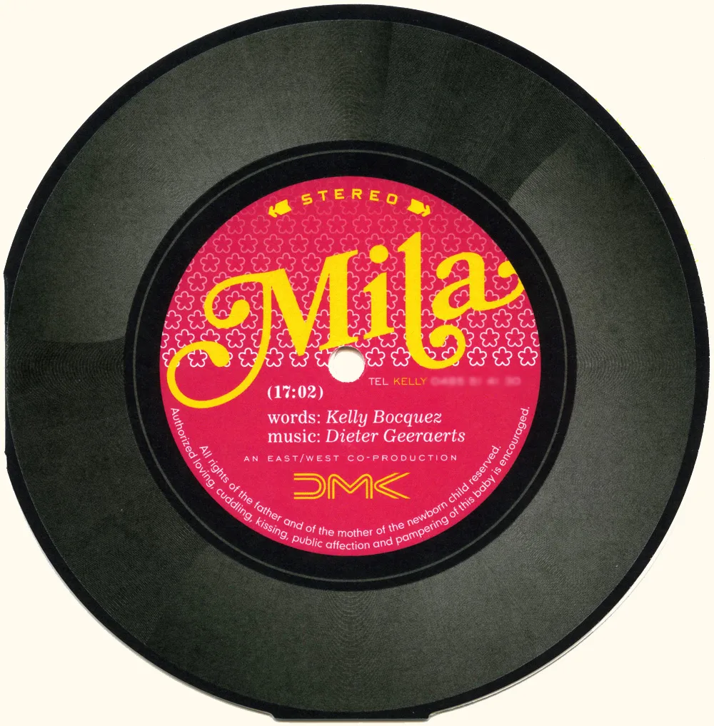
I got this birth announcement in the mail (all the way from Belgium!) that features Bookmania prominently. Designed by Yves Peters (of The FontFeed and elsewhere). Nice!
I saw the new Star Trek movie this last night and was thrilled to spot one of my fonts, Changeling, in a supporting role. Here are some examples from a couple of high resolution publicity stills for the movie:
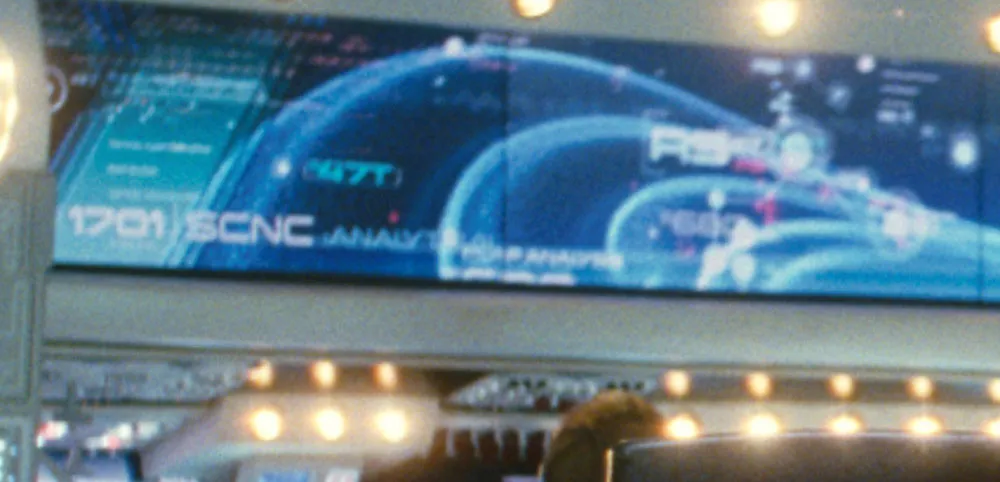
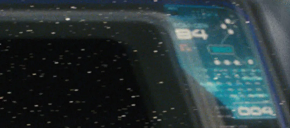
Changeling was a redesign and expansion of an old film font from the seventies called China. I added more weights, more styles, and more characters, as well as modifying the design as I saw fit. One of the more noticeable things I changed was the “4”, which is how I know it’s Changeling that was used in the film.
What’s funny about all this has to do with my choice of the name “Changeling”. It contains all the letters in the name “China” (I added things to it, get it?). A “changeling” refers to something that comes back in a different form, and this was a font coming back in a different form. It’s also the title of an episode from the original Star Trek t.v. show, something I was aware of when I chose the name—the sci-fi connection made me like the name even more, because of the way the font looks. Finally, that particular Star Trek episode was the basis for the first Star Trek movie.
Needless to say, I was in several kinds of geek heaven last night.
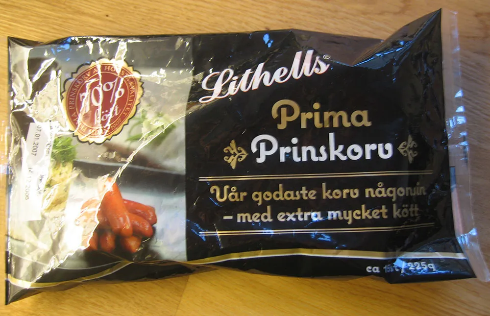
A line of meat products in Sweden is sporting Coquette on its packages. (Thanks to Peter at Fountain type foundry for the tip and the photo.)
