I haven’t been posting much to Notebook lately because I’ve been, well, busy. The thing I’ve been busy with is this:
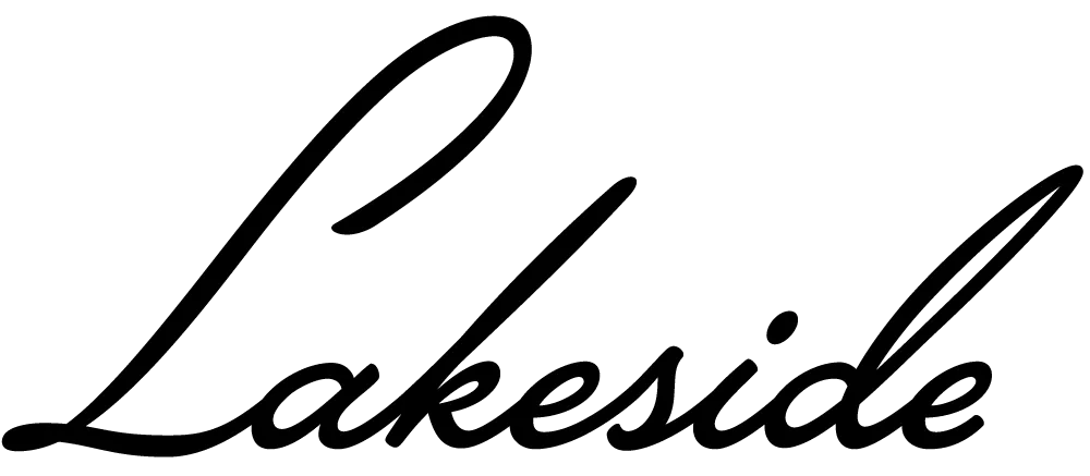
Lakeside is a script face I’ve been working on for the past two years. It was initially commissioned by an independent filmmaker for use in some film titles. It’s based on the hand-lettered titles of the classic 1944 film noir classic “Laura.”
An unusual feature of Lakeside is that it has three styles of capital letters suited to different uses:
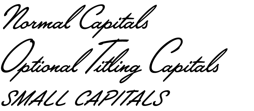
There are normal caps for, er, normal use; over-sized caps for a fancier appearance; and smaller, plainer caps for all-caps settings—something not normally possible with a script font like this.
Lakeside takes advantage of the OpenType format to put a virtual lettering artist at your fingertips. Here is the font with OpenType Contextual Alternates turned off and then on:
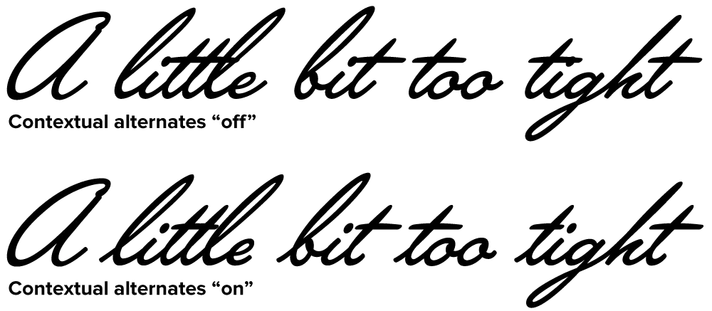
Notice how each letter tailors itself to its position within a word, using a different form depending on whether it comes at the beginning, middle or end. Notice also how the crossbar on the lowercase “t” seems to “know” about adjacent letters and adjusts its width appropriately. (It’s not actually “a little bit too tight,” it’s just that those words are good for showing how the magic works.)
For more information, see the Lakeside Specimen Sheet (496k PDF) and the Lakeside User Guide (1mb PDF).
Licenses for Lakeside can be purchased at Font Bros. Other venues will be added soon.
(Note: Last year I mentioned this font on Notebook when it was still under development. At that time, it was to be called “Launderette.” Unfortunately, that name was taken—twice—so I chose the name “Lakeside” instead.)
When I was asked in 2014 by Bill Moran, artistic director of the Hamilton Wood Type & Printing Museum, to come up with an original wood type design for The Hamilton Wood Type Legacy Project, I wanted to do something that would take advantage of the unique properties of wood type, but also something that hadn’t been done before.
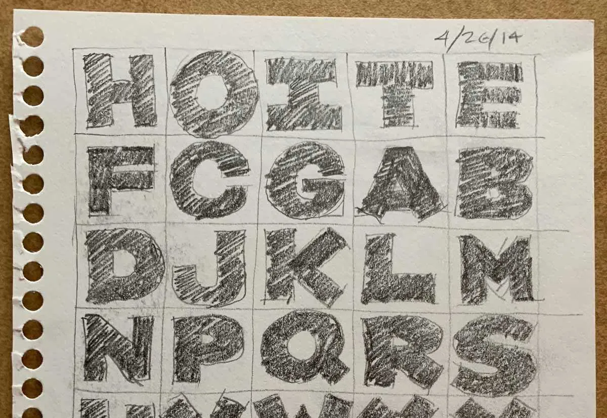
One thing I’d never seen was a monospaced or fixed-width wood typeface, and I thought this could be an interesting idea. But then I thought, what if the characters were not only the same width, but square? That way, the characters could be arranged vertically or horizontally and in any orientation. To a traditional letterpress job printer, a font like this wouldn’t make much sense. But to a modern letterpress printer, who tends to be more interested in self-expression and artistic effects, it could be an unusual and creative design element.
The result is HWT Konop.
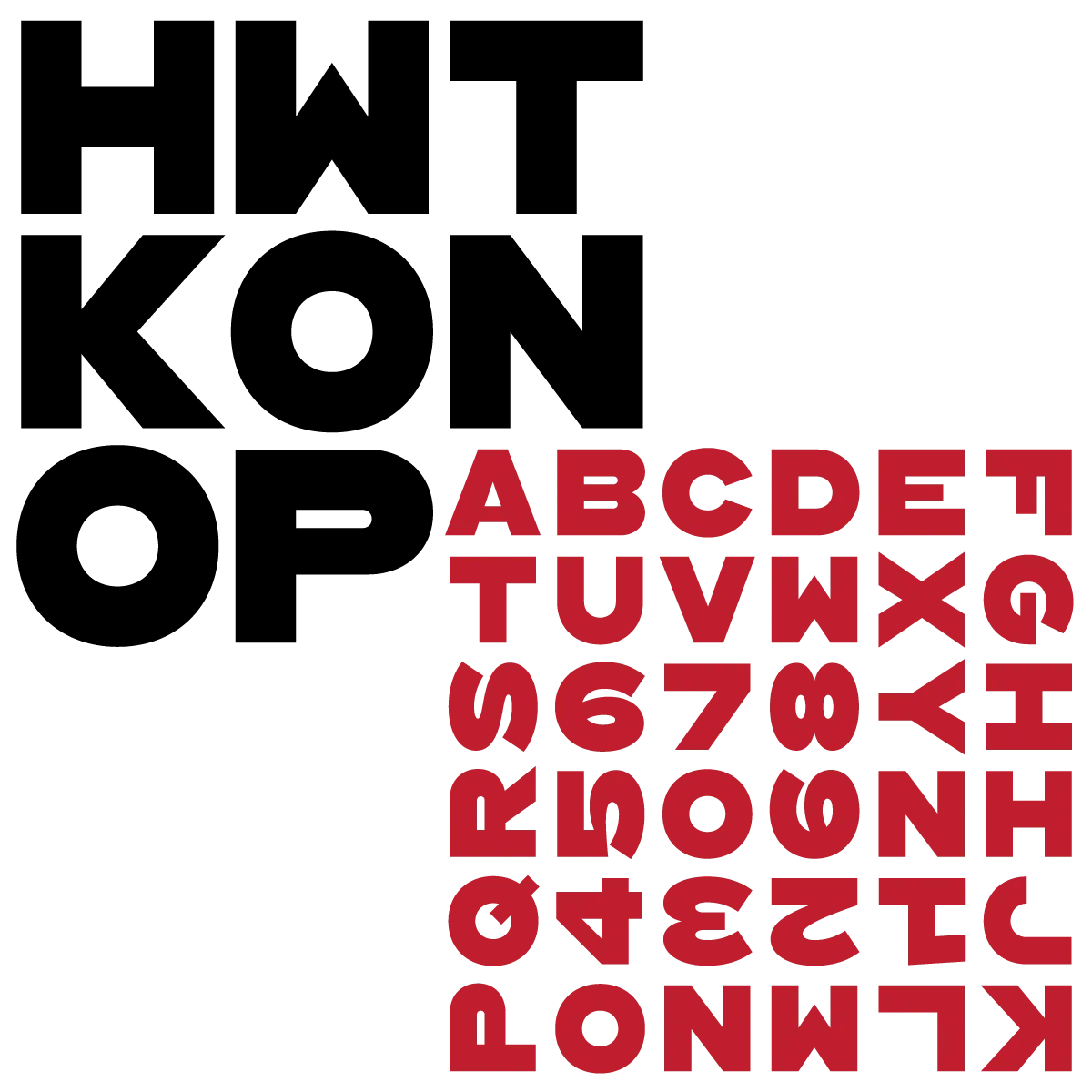
For the letterforms themselves, I decided to use a bold gothic style, reminiscent of gothic wood types but more geometric. Since the characters are meant to be used in any orientation, I set aside some of the usual optical adjustments, such as making verticals thicker than horizontals and making tops smaller than bottoms. This, combined with the distortions needed to get all the characters to fit into squares, results in a quirky but (I hope) charming design.
To provide more design options, I came up with a modular system consisting of three sizes: 12-line, 8-line, and 6-line. These three sizes can be used together like Lego® bricks, with endless arrangements possible. The sidebearings match so that characters always align when the three sizes are used together.
The digital version of Konop replicates the wood type version as much as possible, including the three different size designs. It includes OpenType stylistic sets that allow most characters to be rotated in place, 90° left, 90° right, or 180°, just like the wood type version. I also includes extra characters not available in the wood type version.
Even so, since Konop was designed primarily with wood type in mind, it’s actually simpler and more fun to work with the wood type version than the digital version, if you don’t mind getting your hands dirty.
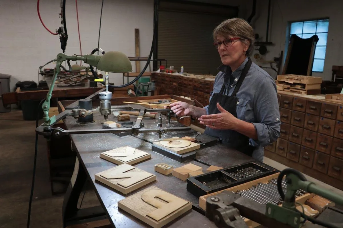
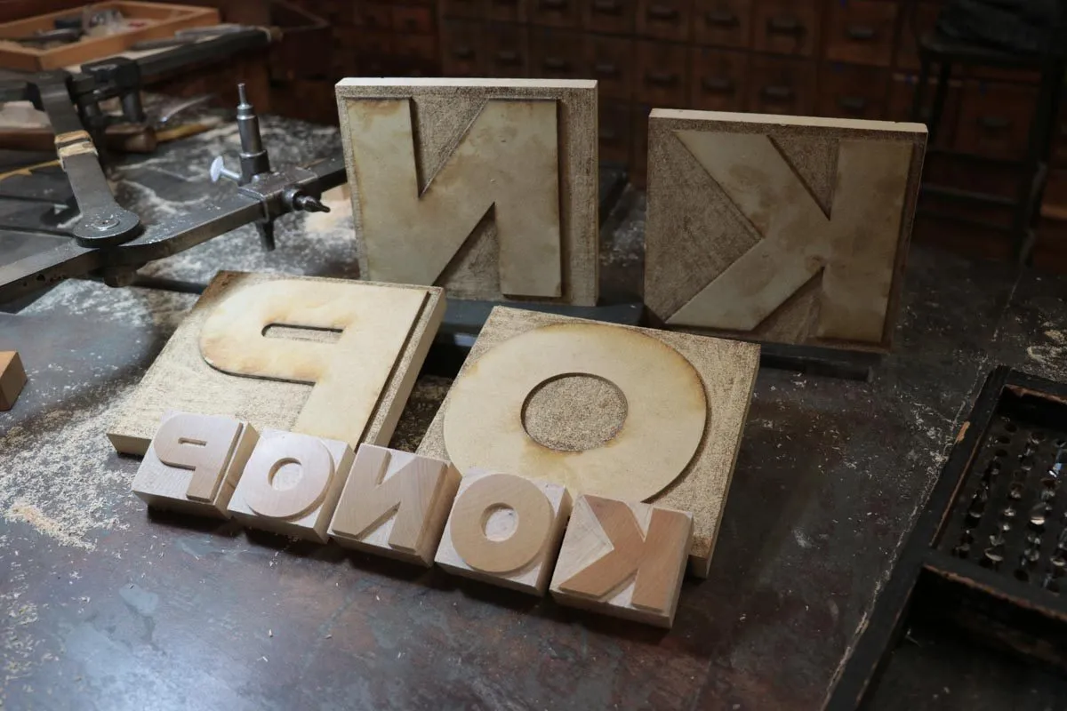
Production on the wood type version is just getting under way. Sample characters were cut last weekend at the Hamilton Wayzgoose by Georgie Brylski Liesch on the pantographic cutter (above) with hand trimming by David Carpenter (below).
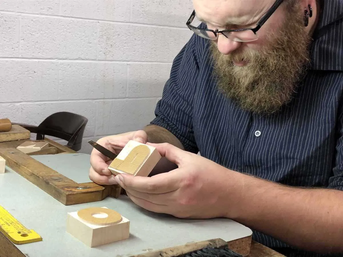
The photo below shows the finished 12-line pieces they cut, with the patterns behind them. The patterns are traced with a guide on the pantograph and a high-speed router cuts the type. The size depends on how the pantograph is set up, but it’s always smaller than the pattern to get the best accuracy. Inside corners and small details are cut by hand.
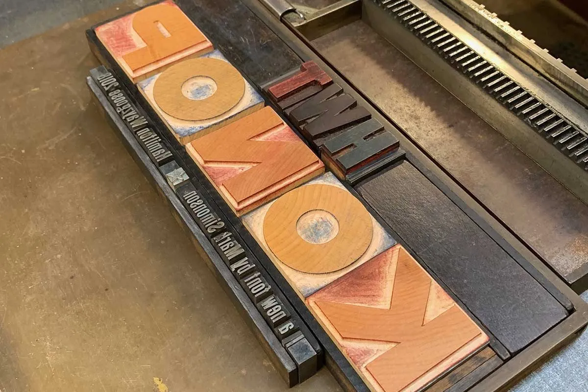
Here it is (below) on a proofing press along with the first proofs. (The right side on the K isn’t quite right, but the finished fonts will be correct.)
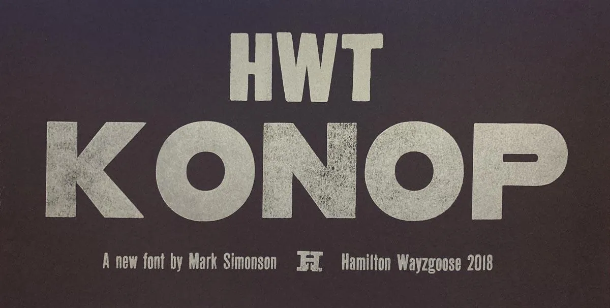
I’m not sure how soon the wood type version will be available for purchase, but you can get the digital version now from P22.
You can read more about HWT Konop here.
(Photos of Georgie, David, and the finished pieces by Bill Moran.)
Mostra (2001) was originally conceived as a caps-only font. The source for its inspiration, lettering on Italian Art Deco posters from the 1930s, rarely included lowercase letters. Nevertheless, not long after I released it, I started thinking about what a lowercase for it might look like.
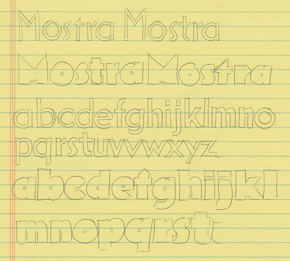
As OpenType fonts grew in popularity and acceptance, an OpenType version of Mostra, with its many alternate characters, seemed inevitable. Separating the alternates across three fonts for each weight was the only practical solution back in 2001. This worked okay, until you wanted to combine alternates from the separate fonts. It’s simply not possible to provide kerning pairs between characters in different fonts. And I did intend for the fonts to be used in this way, not only as separate fonts.
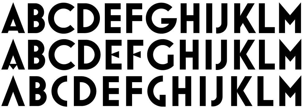
When it came time to develop an OpenType version of Mostra, combining the three fonts into one was the main idea, and it would have been simple enough to go that route, but then I remembered the idea of adding a lowercase. After making some trial designs, I decided it was worth the extra effort.

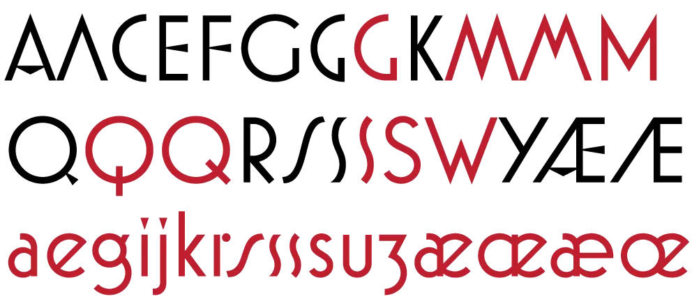
Of course, it takes time to add all those new characters, and the mind tends to wander. Before I finished designing the lowercase, I had thought of even more alternate characters for the uppercase. And, of course, many of these required analogs for the lowercase as well. Upshot: Lots of new characters.
And then I decided to add a sixth weight. I’d been looking at some hairline fonts for some reason and I suddenly thought, wouldn’t it be great if Mostra Nuova had a hairline weight? Yes, it would.

Mostra had 26 capital letters plus 15 alternates. Mostra Nuova has 52 upper- and lowercase letters plus 40 alternates. In the original version, the number of possible letter pair combinations was 650. The number of letter pair combinations for Mostra Nova is 8372. This meant that the number of kerning pairs needed would increase by more than ten fold. Times six weights. This didn’t quite sink in until I was well into kerning. Did I mention that I thought I expected to be done last April? But it was worth it in the end.

Of course, Mostra Nuova has much better language support, covering most Latin-based languages in Western and Central Europe. It also has a special feature so that when you change something to all-caps, things like hyphens and bullets are automatically centered on the height of the caps rather than the lowercase.
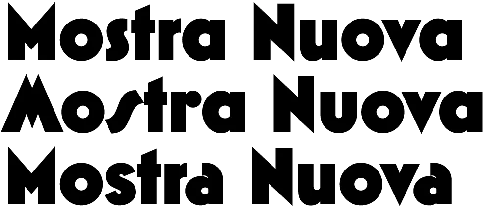
All in all, Mostra Nuova is a much more versatile font than its predecessor. Available now.
One of the ideas on my back burner for a long time has been to add wide styles to Proxima Nova. Condensed and Extra Condensed have been there since the very beginning, but it was missing styles wider than the normal width. It was an obvious thing to add and would make the family even more versatile.
I did some rough preliminary work in 2012 and 2015, but didn’t put serious effort into it until last September, after I finished Dreamboat. The good thing about setting a typeface aside is that, when you come back to it, you can see the problems much more clearly. One of the things I learned when I was a graphic design student is that it’s easier to redesign something than to design something, and that was definitely the case with Proxima Nova Wide.
One of the things I changed was to make it even wider so that I could add two wider widths—Wide and Extra Wide, just as there are two narrower widths. Including the italics, this adds 32 new styles to Proxima Nova (16 for each width).

Naturally, the new styles include all the features and characters of the existing styles of Proxima Nova. I’ve also made a few improvements and tweaks to the existing styles. All of this amounts to a major release: Proxima Nova 4.0. It’s currently available for sale here or for activation in Adobe Fonts.
You can find more info, test and license the fonts, and download PDF specimens on the Proxima Nova page.
Not long after I released Proxima Nova in 2005, people started asking me: “What serif font would work best with Proxima Nova?” It’s very common to combine serif and sans serif typefaces, usually a serif face for text and sans serif for larger sizes or for emphasis or change of tone in text. I usually suggested a modern, such as Century Schoolbook, or a slab serif, such as Rockwell. None of my suggestions felt like a satisfying answer to me, so I started thinking about designing a serif sibling to Proxima Nova.
After some false starts over many years, trying to add serifs to Proxima Nova somehow, I decided instead to create a serif companion—a face that is not simply a seriffed version of Proxima Nova, but a serif typeface designed to harmonize with Proxima Nova, while having its own structure and identity, similar to the way that Morris Fuller Benton’s Century faces harmonize with his Franklin Gothic and News Gothic.
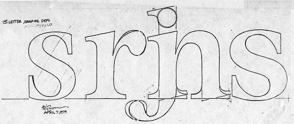
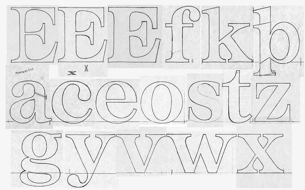
Back in 1979, when I was first dreaming about making typefaces, and around the same time I had the earliest ideas for what would become Proxima Nova, I did some sketches based on the concept of combining the characteristics of several popular serif typefaces—Times, Plantin, Century, and Baskerville—but with proportions similar to Helvetica. The working name was “Metropolis.” Proxima Nova was based on a similar hybrid concept, but with sans serif typefaces. The idea of using something that came out of the same period and the same thinking as my concept for Proxima Nova made sense.

In 2020, I went to work and adapted “Metropolis” as a companion to Proxima Nova, changing some of its details and proportions to harmonize better with its sans serif counterpart. The overall style falls more squarely in the modern category than my 1979 concept, but it retains some old style elements, such as the spurless serifs on the C, G, and S and the structure of the numerals.
The result is Proxima Sera.

Proxima Sera 1.0 contains a subset of the Proxima Nova character set (Greek and Cyrillic are still to come), but it has all the same features—small caps, old style figures, alternate characters, etc. There also is only the regular width. Condensed and Extra Condensed will come later. It has all the same weights, from Thin to Black, plus one more—Extralight.
Proxima Sera works beautifully with Proxima Nova. But, of course, like Proxima Nova, it can stand on its own or play nice with other fonts.
Proxima Sera is available immediately for licensing at most of the usual places.
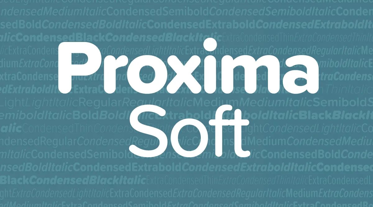
Proxima Soft is an expanded and remastered version of Proxima Nova Soft (2011). Both are rounded versions of my Proxima Nova (2005).

Proxima Nova Soft was originally commissioned by MyFonts in 2010 for use on its website. The following year, after numerous requests, I released it to the general font market. Because MyFonts needed only a few styles (Regular, Medium, Semibold, and Bold), that’s all I did at the time.
Soon, I got requests to do a full family. This was easier said than done. I began work on the full family in 2013. After several false starts, over three years later, it’s finished.
Although the old and new families look similar, there are many small improvements in the design, not just a wider range of styles and more features.

Proxima Soft has the same 48 weights and styles as Proxima Nova—eight weights (Thin to Black), three widths (Normal, Condensed, and Extra Condensed), and both roman and italic for all weights and widths. There is one small difference—no small caps or old style figures. I included these in Proxima Nova, but I’ve never seen them used, so I decided not to put them into Proxima Soft. (I may add them later if people actually do want them.)

A Proxima Nova feature I do see used a lot is the set of alternate characters—a, l, y, and G. Proxima Soft includes them, as well as other Proxima Nova features such as arbitrary fractions, ordinals, and both proportional and tabular figures.

Proxima Soft also contains the same wide language coverage, including support for most Latin-based writing systems as well as Cyrillic, and Greek.
I would have preferred to keep the name Proxima Nova Soft, but there were some problems with that idea. First, there are limits to how long a font name can be. Proxima Nova already pushes the limits in the Condensed and Extra Condensed ranges, and adding the word Soft to every style and weight was not going to work. By calling the new family Proxima Soft, the font names will be exactly the same lengths as in Proxima Nova. Problem solved.
The other perhaps more important reason is that the shared styles—Regular, Medium, Semibold, and Bold—are not identical in design and spacing between the new and old version, which means that documents created with Proxima Nova Soft would have reflow issues if the new fonts were installed in its place, not to mention differences in appearance, especially at larger sizes.
If you liked Proxima Nova Soft, you’ll love Proxima Soft. It’s got more of everything and makes a great companion to Proxima Nova.
Proxima Soft is available at all of my distributors. See the Proxima Soft page for a complete list.
