As you may be able to tell by my sporadic Notebook postings of late, I’ve been a very busy guy. Some of the things I’ve been working on I can’t talk about (yet).
One of the things I can talk about is three new fonts I will be releasing in the near future. All three were inspired by hand lettered titles in 1940s films.
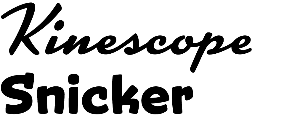
Kinescope and Snicker are loosely based on title lettering in Fleischer Studio’s animated Superman films from the forties.
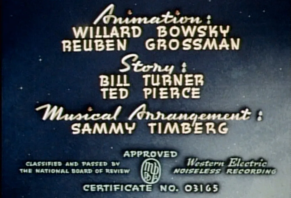
In both fonts I’ve ended up with something a bit different than the source of my inspiration, but I think you can see the resemblance.
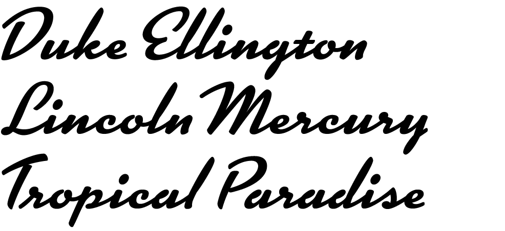
Kinescope will include context-sensitive characters. For example, when a letter falls at the end of a word, the connecting stroke is clipped off. This gives settings a more natural hand-lettered look. Stylistically, Kinescope falls somewhere between Brush Script and Kaufmann Script, but more elegant than either.
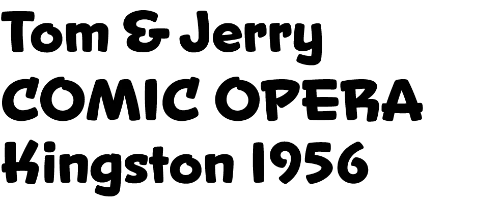
Snicker is a cartoony block letter style. One of the design challenges with Snicker was to come up with a suitable lowercase—the lettering in the Fleischer titles that inspired me only used capitals. Although it is intended for display sizes, it works pretty well for text. Consequently, I’m toying with the idea of adding a lighter weight and italics. It could perhaps become a typographically interesting alternative to Comic Sans…

The third font, Launderette, is based closely on lettering used in the titles of the 1944 Otto Preminger film, Laura:
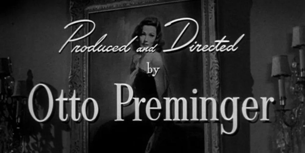
This font was originally commissioned by a filmmaker who wanted to use the same “font” in the titles of his own film. As with most films of that time, the titles were hand-lettered by an artist, not typeset.
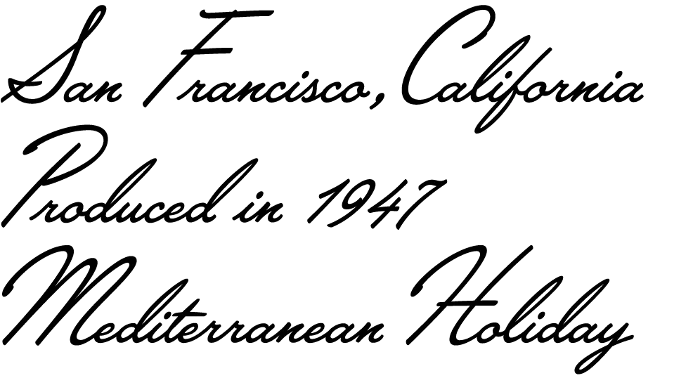
The challenge with this font was that there were very few characters in the source lettering. Most of the characters had to be created from scratch to match the style of the existing ones. Launderette, like Kinescope, will have context-sensitive characters to give it a custom, hand-lettered look.
I hope to release these new fonts by the end of the year.
Update: Kinescope and Snicker have now been released (April 30, 2007). Unfortunately, the name Landerette was already in use (twice!), so I changed it to Lakeside. Lakeside has also been released (February 7, 2008).
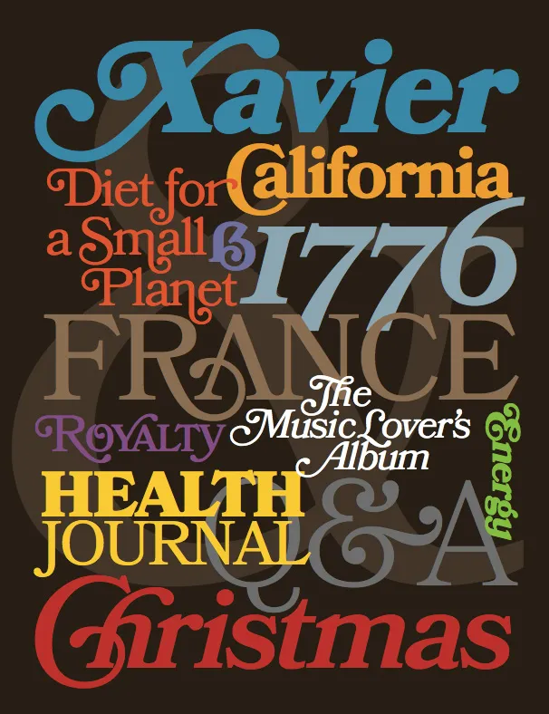
For the last four years, I’ve been working on a revival of the classic ATF Bookman Oldstyle and the Bookmans of the 1960s. But it’s not a slavish replica. It’s my own idea of what Bookman could be. It’s the revival I always wished someone would do.
I thought about doing a cursive italic, like others have tried, but in the end I decided that the original slanted roman should be preserved. Bookman has always been known for its swashes, so I also made a superset of the dozens of swash characters that have been added to Bookman over the years.
I wanted to go beyond its past and make something new. I added things that Bookman never had like small caps, old style figures, alternate characters, ligatures, stylistic sets, extensive language support, and more.
The family is composed of five weights—Light, Regular, Semibold, Bold, and Black, plus italics.
It’s my love letter to the classic Bookman: Bookmania.
Coming soon to all the places you can get my fonts.
Follow @marksimonson on Twitter for updates on availability.
Update: Now available at Fontspring. Other distributors to follow.
I’ve also updated my website and added a page for Bookmania here where you can download a PDF specimen booklet.
I first released Coquette in late 2001. It had three weights: Light, Regular, and Bold. I’ve updated it a few times since then, most significantly in 2010 with the OpenType version and expanded language support.
For a long time, even before the initial release, I’ve wanted to add more weights, especially on the bold end of the range. And there was certainly room for another weight on the light end. I’m therefore very pleased to announce the addition of three new weights to Coquette: Thin, Extrabold, and Black.

I took the opportunity to add a few more features to the family.
First, I’ve filled out some gaps in the character set. Previously, Coquette had only the fi and fl ligatures, a holdover from the pre-OpenType days. Version 2.0 now has a complete set of f-ligatures. You might have also noticed that Coquette was missing all those random math characters that are part of the standard character sets in most fonts. It now has them. I don’t imagine they’ll be of much use (which is why I left them out in the first place), but they are there if you need them now.

I’ve also added some OpenType features that I thought would be useful.
The first is arbitrary fractions. If you type number-slash-number and apply the OpenType Fraction feature, you will get nicely formatted vulgar fractions. (It seems unfair to call them vulgar. I think they look quite tasteful.) As a side effect of adding this feature, Coquette now includes superscript figures.

The second OpenType feature is support for a few alternate characters. Over the years I’ve noticed that sometimes designers don’t seem to like the little blobs I put on some of the characters, such as the b and o, so they remove them. Coquette 2.0 includes these alternate forms. The other modification I’ve seen is with the lowercase s, which has a stylized script form. Coquette 2.0 includes a more conventional lowercase s as an option. All of these have the effect of making Coquette look a bit more plain, but sometimes that’s what you want. (I didn’t make an option to remove all the blobs. It’s just not Coquette otherwise.)

There is also an alternate ampersand. It’s smaller than the default one—about the same height as the figures—and has a simpler design. You can use it anywhere, but it works better than the default when set next to caps.

So, that’s it. I’m really excited about this new release of Coquette. I’ve been wanting to do it for a long time. It should be available from your favorite online font store by the time you read this. More information here.
2. Mostra
3. Coquette
4. Changeling
5. Proxima Sans
6. Refrigerator
7. Goldenbook
8. Kandal
10. Blakely
If you pay close attention, you may notice two additions to the list of fonts over on my site: Diane Script and Filmotype Honey. I’ve been meaning to add these for a while (a long while in the case of Diane Script).
Diane Script (and Diane Script Première) were released in late 2008 through FontHaus, who commissioned me to digitize them. More about Diane here.
Filmotype Honey is my latest contribution to the Filmotype project and was released on the Font Bros site back in February.
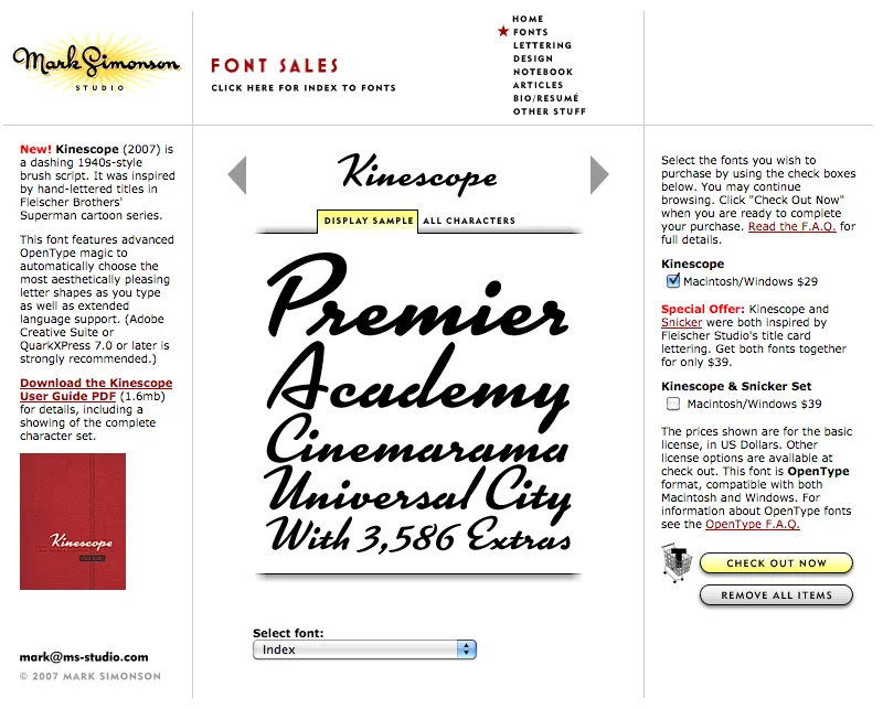
Party like it’s 2007. Note the shopping cart on the right side.
At one time, early in the history of Mark Simonson Studio, I sold fonts directly from my website. This was back in the early 2000s when there weren’t a lot of options.
I started selling fonts on the web in 2000 using third-party sites, first through Makambo (which closed its doors not long after I signed up), followed by MyFonts (2001), FontHaus (2001), Agfa/Monotype (2004), FontShop (2005), and Veer (2005).
In 2004, I decided to also sell fonts directly, using a service called DigiBuy, letting me get a bigger part of the retail font price, but also to simplify the purchasing experience for customers.
It was good while it lasted. Quite often, my site brought in more income than my best distributors for a given month. But in 2007, DigiBuy was shut down. The alternative they offered was tailored for selling shareware software, and was a poor fit for selling fonts. At the time, my distributors were doing well enough for me, so I made the hard decision to stop selling fonts directly and sell only through third parties.
Fortunately, my distributors soon took up the slack. And, to be honest, I was glad to have the burden lifted from my shoulders. When you sell direct, that means doing customer support. As a one-person business, this was taking a lot of my time. The new arrangement let me spend more time working on fonts. It was a fair trade-off.
Fast forward to 2021, and Mark Simonson Studio is now part of The Type Founders. TTF has the resources to bring direct sales back, and that’s just what they’ve done. If you have a favorite vendor, by all means use them. But if you want to get your fonts direct from the source, now you have that option.
The way it works is, each font page has various “buy” buttons. Click on any of these and a slide-over will appear that lets you select license types, term or other options (if applicable), and which fonts you wish to purchase. Note: Click on the styles to add them. Once you’ve made your selection, click on the “Add to cart” button. You can check out immediately or close the slide-over if you want to select other fonts before checking out. Once you’re ready to check out, just follow the instructions.
If you’re not sure what kind of license to choose, this page should help. My standard licenses for desktop, web, and apps can be seen here.
And if the kind of license you want is not one of these standard ones, drop an email to info@marksimonson.com.
Pretty simple. (Well, as simple as it can be.)
But that’s not all: Remember the static style previews I’ve had on my site for the last ten years? Gone, replaced with live, editable font previews for each style. This makes it easy to see if a font will work for, say, a company name or a headline.
Note: A few of the typefaces listed on my site are not available for direct sales, because I did them for another type foundry who own the fonts. These include Diane Script (Fonthaus), the Filmotype fonts, and HWT Konop (Hamilton Wood Type/P22). Links to where you can purchase are provided. And of course, you can’t buy Anonymous Pro because it’s free to use.
Finally, the list of fonts is now in alphabetical order, instead of newest releases first, which should make it easier to find the fonts you’re looking for.
